easyGEO User Guide
easyGEO can easily extract, process, re-analyze and visualize most recent gene expression data from NCBI GEO database. The resulted DE table can be seamlessly imported to easyGSEA for functional enrichment analysis or easyVizR for multiple comparisons.
Demo sessionStep 1: Extract GEO data
easyGEO extracts data of an NCBI GEO series, specified by its GEO accession number, beginning with “GSE”. Alternatively, easyGEO provides an option to analyse user-supplied datasets, either one’s own or those extracted from other sources.
Retrieval by GSE number
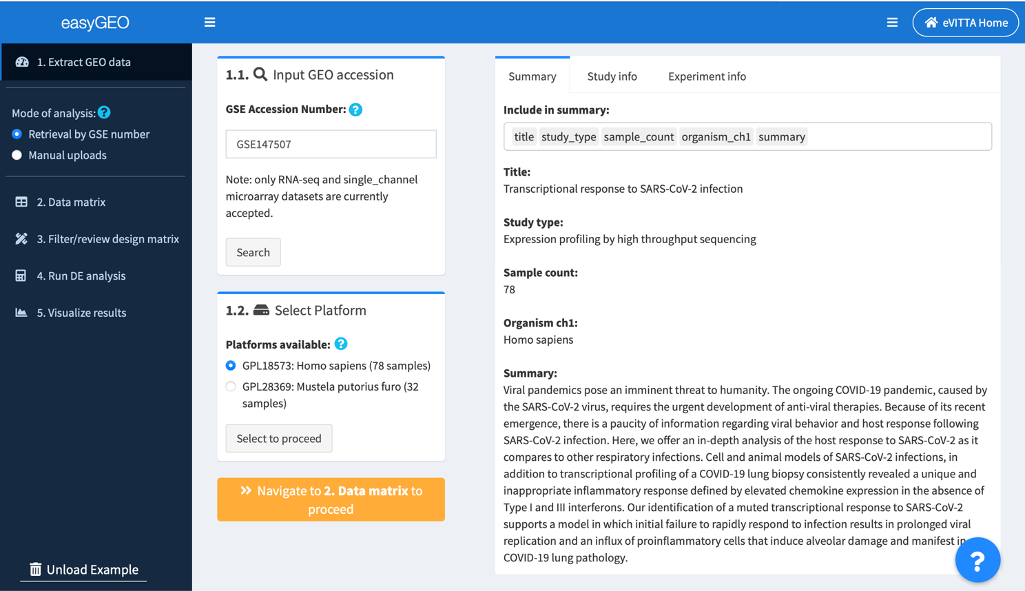
1.1. Retrieve a data series by its accession number (GSE*)
Input the unique GSE number for the study you are interested in and click Search. Currently we support analysis on single channel microarray and most RNA-seq studies.
The example dataset was from the first published study on SARS-CoV-2-infected transcriptomes (Blanco-Melo et al., 2020).
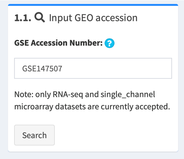
1.2. Select corresponding platform to proceed
After initial retrieval, data are stratified by the microarray or sequencing platforms used by the study, such as GPL18573 platform of Illumina NextSeq 500 (Homo sapiens) and GPL28369 platform of Illumina NextSeq 500 (Mustela putorius furo).
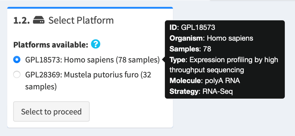
Hover over each choice for more information about the platform, e.g. platform ID, organism and experimental strategy. Select the one that you are interested in and click Select to proceed.
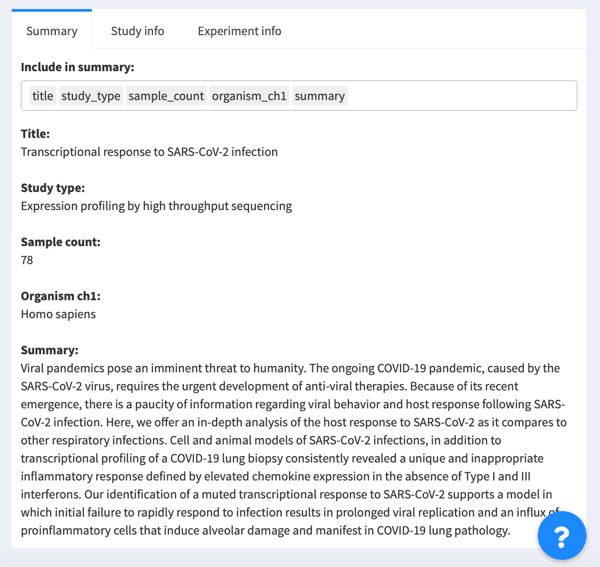
1.3. Review metadata about data series
You may read more information about the data series, such as the study title, the experimental strategy, the author names and their contact information, on the right panel.
1.4. Go to the next tab: Data matrix
Proceed to 2. Data matrix.
Manual uploads
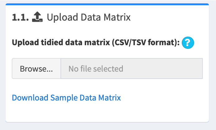
1.1. Upload a gene expression matrix (data matrix)
The data matrix should be comma- or tab-delimited (csv, tsv, tab, txt). The first row of the matrix should be sample names; must match the sample names in the design matrix (see below "1.2. Upload a matrix describing experimental designs (design matrix)"). The first column of the matrix should be gene names; no duplicates are allowed.
For example,
| Series1_NHBE_MOCK_1 | Series1_NHBE_MOCK_2 | Series1_NHBE_MOCK_3 | |
|---|---|---|---|
| DDX11L1 | 0 | 0 | 0 |
| WASH7P | 29 | 24 | 23 |
| FAM138A | 0 | 0 | 0 |
| OR4F5 | 0 | 0 | 0 |
| aagr-4 | 0.78 | 6.31 | 7.23 |
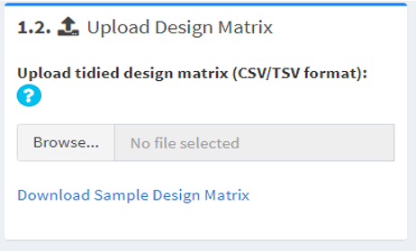
1.2. Upload a matrix describing experimental designs (design matrix)
The design matrix should be comma- or tab-delimited (csv, tsv, tab, txt). The first row of the matrix should be sample attributes (e.g. strain names, experimental conditions, patient groups); no duplicates are allowed. The first column of the matrix should be sample names; must match the sample names in the data matrix.
For example,
| cell.line | cell.type | strain | subject.status | time.after.treatment | |
|---|---|---|---|---|---|
| Series1_NHBE_Mock_1 | NHBE | primary human bronchial epithelial cells | N/A | N/A | N/A |
| Series1_NHBE_Mock_2 | NHBE | primary human bronchial epithelial cells | N/A | N/A | N/A |
| Series1_NHBE_Mock_3 | NHBE | primary human bronchial epithelial cells | N/A | N/A | N/A |
| Series1_NHBE_SARS-CoV-2_1 | NHBE | primary human bronchial epithelial cells | USA-WA1/2020 | N/A | N/A |
| Series1_NHBE_SARS-CoV-2_ | NHBE | primary human bronchial epithelial cells | USA-WA1/2020 | N/A | N/A |
| Series1_NHBE_SARS-CoV-2_3 | NHBE | rimary human bronchial epithelial cells | USA-WA1/2020 | N/A | N/A |
1.3. Go to the next tab: Data matrix
Proceed to 2.Data matrix
Step 2: Process data matrix
This step allows you to review and/or load the gene expression data provided by the authors.
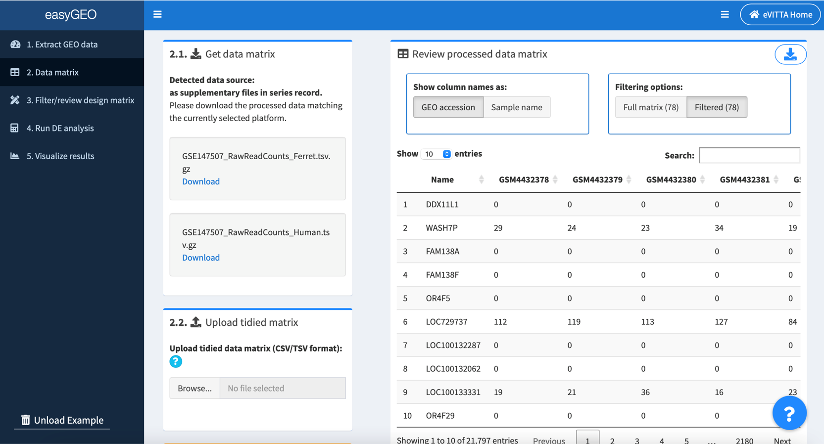
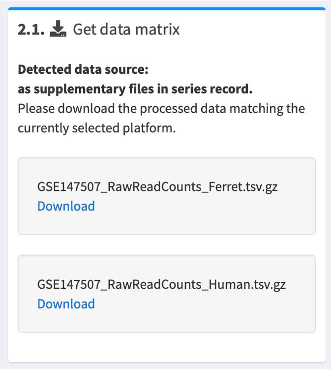
2.1. The source of gene expression data will be automatically detected
- If the gene expression data are found in GEO's data matrix system, the data matrix will be automatically loaded.
- If the authors have submitted their gene expression data as supplementary files, you will have to download the one(s) you are interested in.
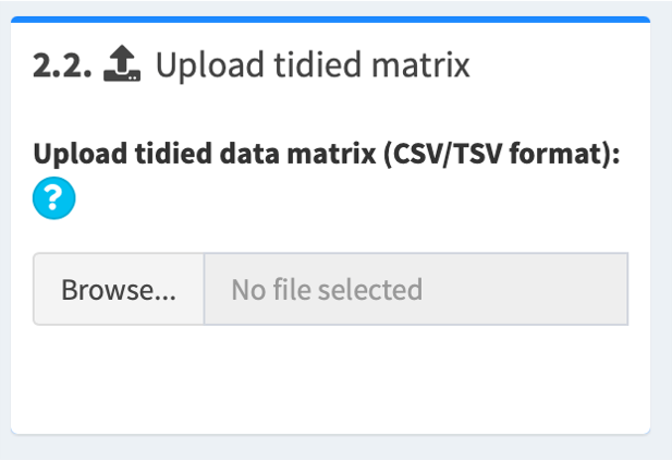
2.2. Upload the tidied data matrix in csv/tsv format
Once you have downloaded a supplementary file, please decompress it and check for the following:
- If downloaded data files contain raw/normalized counts (e.g. CPM, FPKM, RPKM), please tidy them up according to our instructions. Then upload the processed file in step 2.2. Upload tidied matrix.
- If downloaded data are analyzed data (e.g. logFC, p value, FDR), you can proceed directly to easyGSEA for enrichment analysis or easyVizR for multiple comparisons.
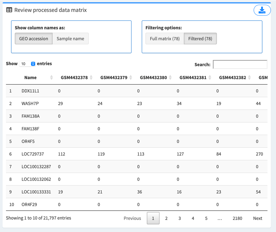
2.3. Review the data matrix
Preloaded or uploaded data matrix are displayed on the right of the screen.
If it’s an auto-retrieval session, Show column names as options are provided to toggle between “GEO accession” (unique ID for each sample as stored in GEO database, which begins with “GSM”, e.g. GSM4432378) and “Sample name” (more descriptive name provided by the series’ authors, e.g. Series1_NHBE_Mock_1).
Filtering options provide a way to review the full data matrix or matrix filtered by selected samples in “3. Filter/review design matrix”. Number in parentheses denotes number of samples.
Click the top right button to download the data matrix for record, if needed.
2.4. Proceed to 3. Review/filter design matrix.
Step 3: Review and/or filter design matrix
This step allows you to review the design matrix submitted by the authors and filter the samples of interest.
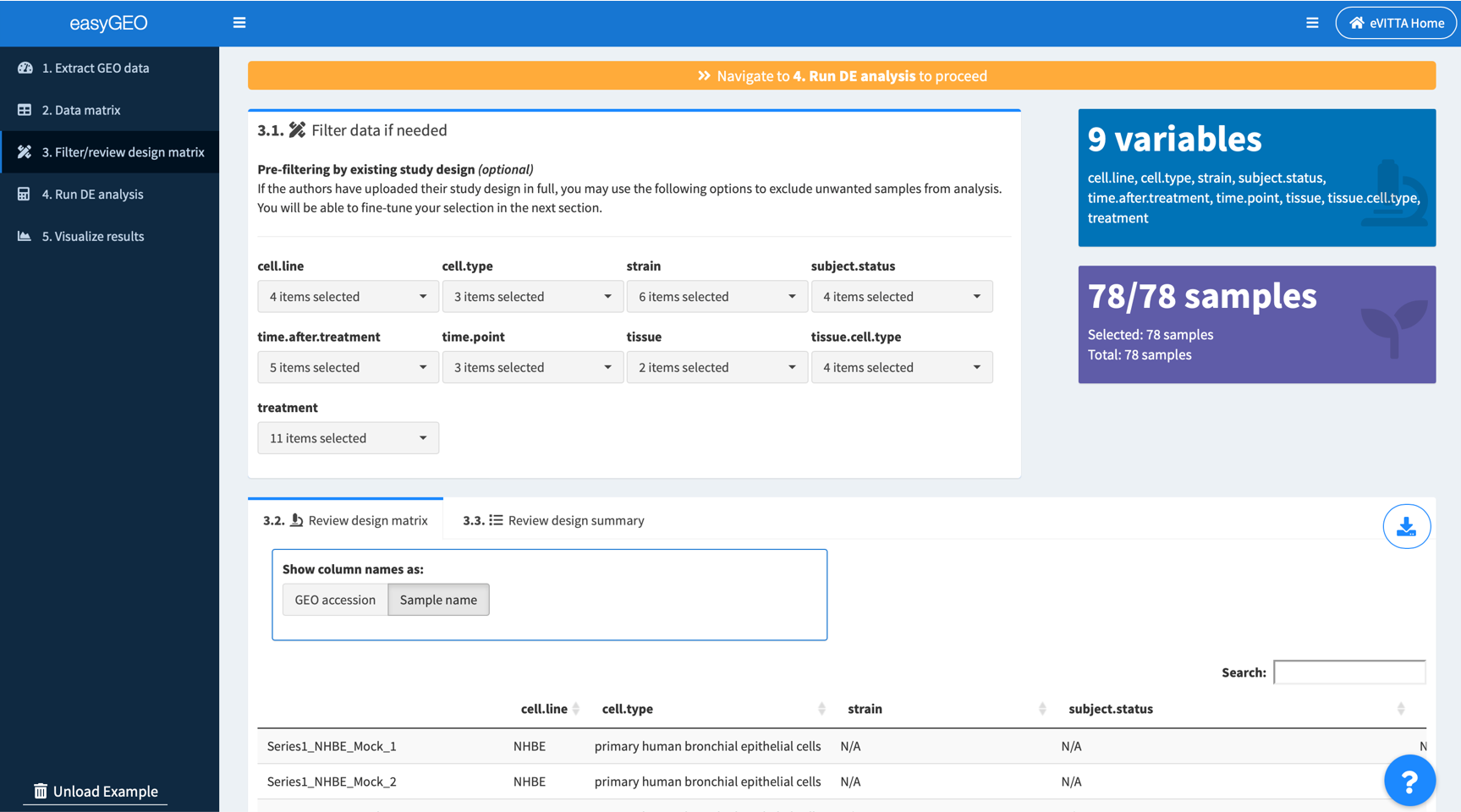
3.1. (Optional) Filter samples according to the experimental factors, e.g. cell types, mutants, conditions, treatments
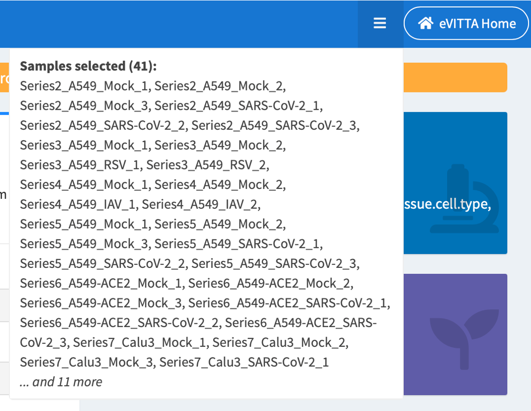
Filter samples by selecting experimental factors of interest.
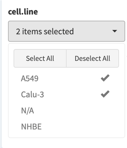
Selected samples are tallied and displayed in the dropdown on top right of the screen.
3.2 Review the filtered design matrix
Samples are displayed as rows. Experimental variables are displayed as columns. Review carefully so as to make sure correct samples are selected for differential expression analysis later. If it’s an auto-retrieval session, Show row names as options are provided to toggle between “GEO accession” (unique ID for each sample as stored in GEO database, which begins with “GSM”, e.g. GSM4432378) and “Sample name” (more descriptive name provided by the series’ authors, e.g. Series1_NHBE_Mock_1).
Click the top right button to download the design matrix for record, if needed.
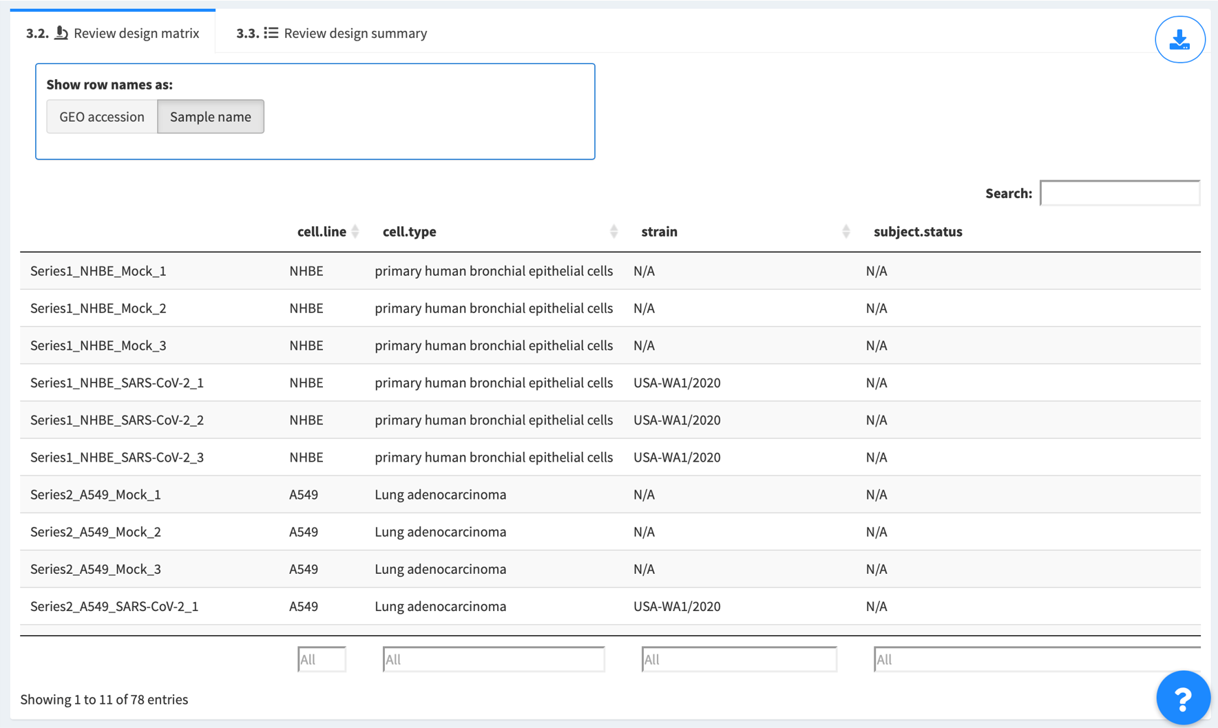
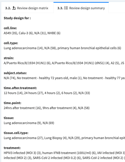
Summary about the experimental designs for the retrieved data series is also provided. Number in parentheses denotes number of samples included for a particular experimental variable
3.3. Proceed to 4. Run DE analysis.
Step 4: Run DE analysis
Now you are ready to perform differential expression (DE) analysis and able to download and visualize the results!
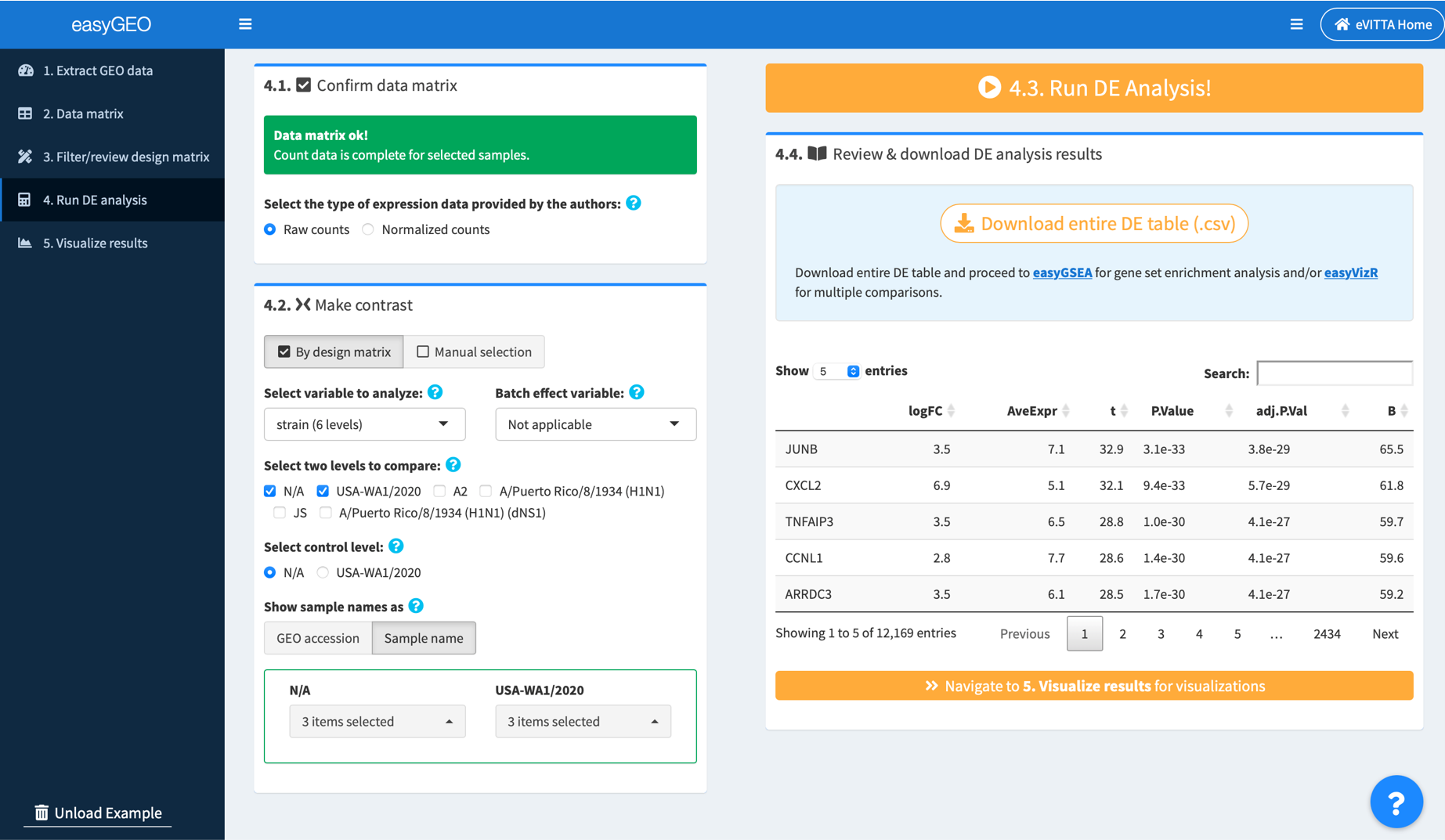
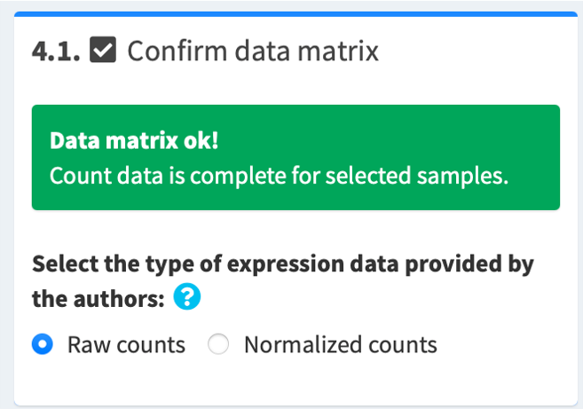
4.1. Confirm data matrix and select data type
If the data matrix is complete, you will see a green "Data matrix ok!" message. Then, select the type of count data provided by the authors:
- If microarray, select normalized counts
- If RNA-seq, select according to the data provided by the authors
4.2. Select samples to analyze
Please select the samples in the control group and those in the experimental group to perform DE analysis. There are two ways to select samples:
- If the authors have submitted their study design in full, you can use By design matrix to select the samples for comparisons
- Manual selection is for any combination of samples. You may manually select samples in the control and the experimental groups.
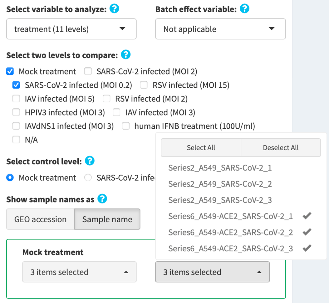
4.2a. Make contrast by design matrix
- Select an experimental variable of interest, e.g. treatment, genotype
- (Optional) If there’s a variable named with “batch” as a keyword, that variable is pre-selected as the batch effect variable. You may click to re-select the variable if needed.
- Select two levels to compare, e.g. SARS-CoV-2 infected (MOI 0.2) vs. Mock treatment.
- Select the control level, e.g. Mock treatment
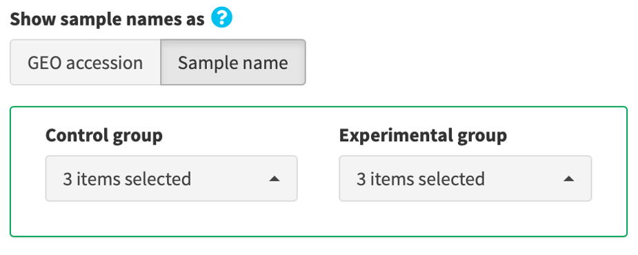
- Review the samples in the control and the experimental groups. Unselect inappropriate and/or unwanted samples, if needed.
4.2b. Make contrast by manual selection
Manually assign samples into the control and the experimental groups by clicking the provided selection buttons.
4.3. Click 4. Run DE Analysis!
Once data matrix and contrast selection are ready, an orange run button is provided on the top right corner of the screen. Click to perform DE analysis.

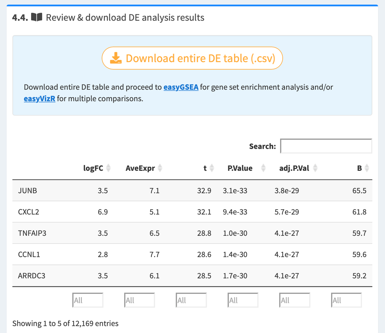
4.4. Review and download DE table
Once the analysis is complete, you may review the resulted DE table. Download the DE table, and proceed directly to easyGSEA for functional profiling, and/or easyVizR for multiple comparisons.
4.5. Navigate to 5. Visualize results
Step 5: Visualize Results
Explore different plots and diagrams to have a better understanding of the dataset. You can also easily search for and visualize the expression level changes of genes of interest.
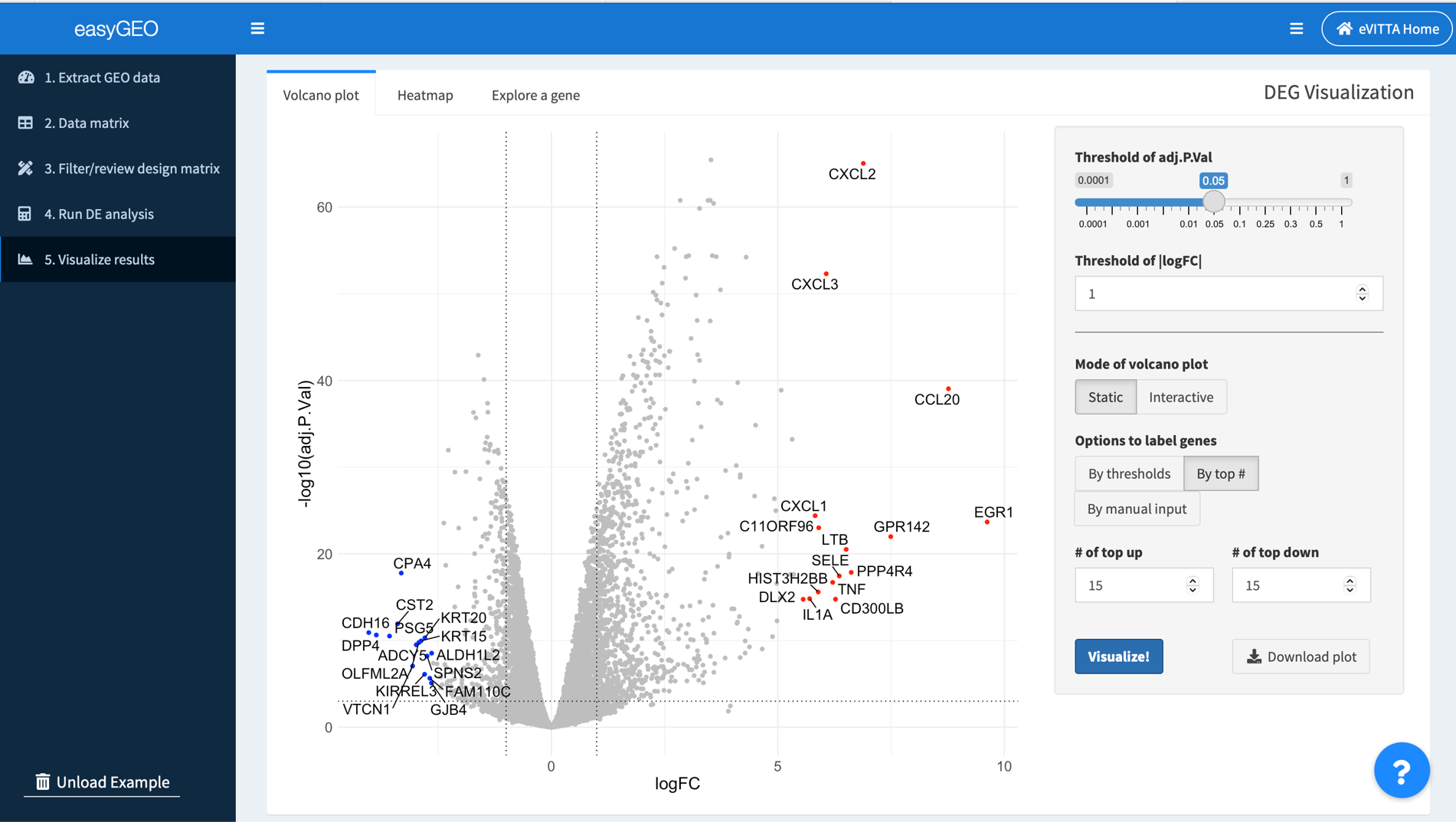
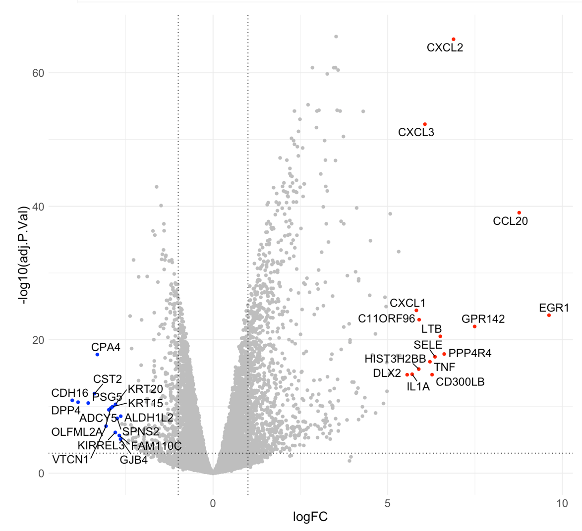
5.1. Visualize the top/significantly regulated genes in a volcano plot
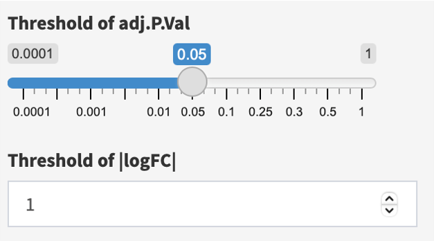
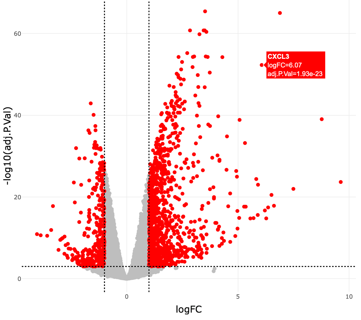
In volcano plots, log2 transformed fold change (logFC) is plotted along the x-axis. -log10 transformed adjusted P-value (padj) is plotted along the y-axis. Horizontal and vertical dashed lines are drawn to indicate the user-defined thresholds of padj and |logFC|, respectively.
You can adjust the parameters on the right panel to customize the plot and visualize your genes of interest.
First, adjust thresholds of adj.P.Val (default < 0.05) and |logFC| (default >= 1), if needed.
Second, in the Static mode, there are three ways to visualize your genes of interest:
- By thresholds, genes that meet the defined thresholds are highlighted in red;
- By top #, the volcano displays the top up (red) & down (blue) regulated genes;
- By manual input, you can locate your genes of interest in the volcano plot by manual inputting the gene IDs
In the Interactive mode, genes that meet the user-defined padj and |logFC| thresholds are highlighted in red. Hover labels show details about each gene’s name, logFC, and padj.
5.2 Visualize the top/significantly regulated genes in a heatmap
easyGEO also provides an interactive heatmap where you can visualize and explore the expression level changes of genes in each biological repeat.
Genes along the y-axis are colored in each sample based on their expression values. Hover labels over each data point show detailed statistics. As with the volcano plots, genes can be highlighted in three modes, and hover labels over each data point show detailed statistics.
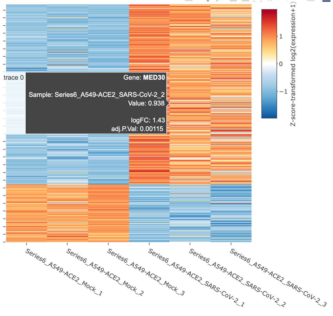
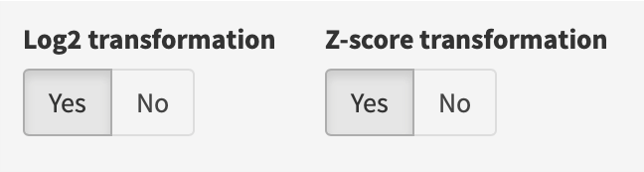
If “Log2 transformation” is selected, each expression value (counts per million (CPM) if raw counts; original values in the gene expression matrix otherwise) is added by 1 and log2 transformed; if “Z-score transformation” is selected, z scores are computed per gene according to its expression values across samples.
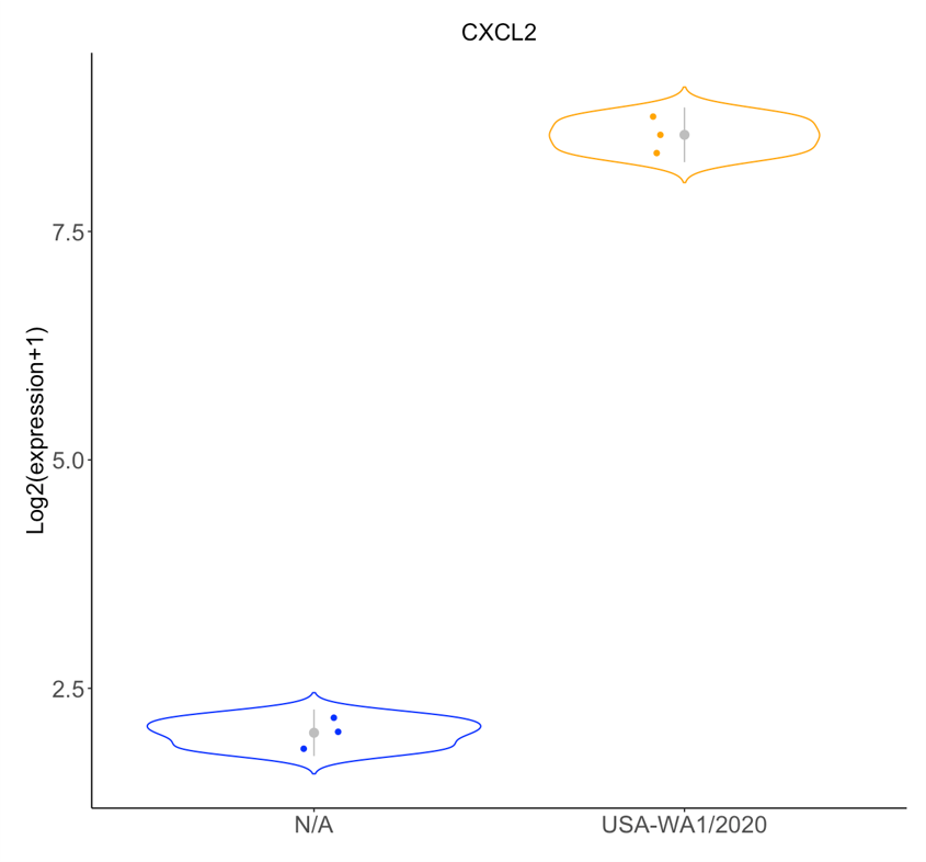
5.3. Explore an individual gene
Search for a gene and visualize its expression level changes with violin and box plots.
Distributions of expression values for a selected gene of interest are plotted along the y-axis. In violin plots, standard deviations (s.d.) are indicated with grey perpendicular lines.
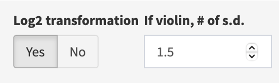
If needed, log2 transform (default, yes) the expression values, and/or adjust the # of s.d. to display (if violin plot) in the right panel.
Support
Feel free to reach us at evitta@cmmt.ubc.ca if you have any questions.
Known issues
- Safari users: for the plotly interactive graphs, the top right "download as png" button might not work. This is a bug within plotly itself. Please download as html or take a screenshot instead.