easyGSEA User Guide
easyGSEA leverages up-to-date and species-specific biological knowledge to discovering and interpreting trends in the huge lists of genes or proteins generated by many functional genomics techniques, such as gene expression microarray, RNA-seq, ChIP-seq, GWAS results, and methylation array, etc.
Currently supported modes of analysis: pre-ranked Gene Set Enrichment Analysis (GSEA) & OverRepresentation Analysis (ORA).
Demo sessionIntroduction
There are two predominantly used enrichment methods to discover the molecular mechanisms that underlie gene expression datasets: (i) overrepresentation analysis (ORA), testing whether a gene set contains disproportionately many genes of significant expression change, and (ii) pre-ranked gene set enrichment analysis (GSEA), testing whether genes of a gene set accumulate at the top or bottom of the full gene vector ordered by direction and magnitude of expression change (Geistlinger et al, 2021).
Both methods are powered by a priori established gene sets, groups of genes that share common biological function, chromosomal location, or regulation. Successful gene sets can help identify underlying genetic abnormalities or signal transduction networks driving disease pathologies and help effectively bridge gene expression data with biological significance. (Subramanian et al, 2005; Bild & Febbo, 2005)
In ORA, differential expression (DE) scores are calculated, the full expression matrix is reduced to a list of genes passing a threshold (e.g. |fold change| ≥ 1, FDR < 0.05) known as differentially expressed genes (DEGs), and hypergeometric testing is performed to identify the gene sets that contain more-than-randomly-occurring DEGs. In GSEA, DE scores are computed, but users do not need to define a threshold. Instead, the genes are ordered in a ranked list, according to their DE between the classes, and the members of a gene set is assessed for their rank positions in the list. Next, an enrichment score (ES) is calculated to reflect the degree to which a gene set is overrepresented at the extremes (top or bottom) of the entire ranked list. Then, the statistical significance (nominal P value) of the ES is computed using an empirical phenotype-based permutation test procedure that preserves the complex correlation structure of the gene expression data. Finally, when an entire database of gene sets is evaluated, the estimated significance level is adjusted to account for multiple hypothesis testing.
ORA has been reported with analytical challenges. For example, no individual gene may meet the threshold for statistical significance after correcting for multiple hypotheses testing because the relevant biological differences are modest relative to the noise inherent to the quantification technology; alternatively, one may be left with a long list of statistically significant genes without any unifying biological theme; and when different groups study the same biological system, the list of statistically significant genes from the two studies may show distressingly little overlap. Therefore, GSEA has been established (Subramanian et al, 2005).
easyGSEA provides both GSEA and ORA analysis modules.
Supported Species & Databases
We currently support 11 species with a comprehensive list of monthly-updating gene set (GS) libraries, including unique and species-specific FlyBase, WormCat, WormBase and SGD ontologies. Each GS is named as “UUU_XXXXXXX%DDD”, where UUU = the unique identifier of the GS’s originating database, XXXXXXX = the GS description, and DDD = the unique ID (if any) of the GS.
- Bos taurus
- Pathway: KEGG, Reactome Location; Reactome Pathway; Wikipathways
- Gene Ontology: Biological Process; Cellular Component; Molecular Function
- BioGRID gene interactions
- Caenorhabditis elegans
- WormCat (Holdorf et al. 2020): WormCat Category 1, 2 & 3
- Pathway: KEGG, Reactome Location; Reactome Pathway; Wikipathways
- Gene Ontology: Biological Process; Cellular Component; Molecular Function
- WormBase: Anatomy Association; Development Association; Disease Association; Disease Association by Orthology; Phenotype Association; RNAi Phenotype
- BioGRID gene interactions
- Canis lupus familiaris
- Pathway: KEGG
- Gene Ontology: Biological Process; Cellular Component; Molecular Function
- Other: TF2DNA
- BioGRID gene interactions
- Danio rerio
- Pathway: KEGG, Reactome Location; Reactome Pathway; Wikipathways
- Gene Ontology: Biological Process; Cellular Component; Molecular Function
- BioGRID gene interactions
- Drosophila melanogaster
- Pathway: KEGG, Reactome Location; Reactome Pathway; Wikipathways
- Gene Ontology: Biological Process; Cellular Component; Molecular Function
- FlyBase: Disease Model Annotations; Physical Interactions
- BioGRID gene interactions
- Other: TF2DNA
- Gallus gallus
- Pathway: KEGG, Reactome Location; Reactome Pathway; Wikipathways
- Gene Ontology: Biological Process; Cellular Component; Molecular Function
- BioGRID gene interactions
- Homo sapiens
- Pathway: KEGG, Reactome Location; Reactome Pathway; Wikipathways
- Gene Ontology: Biological Process; Cellular Component; Molecular Function
- MSigDB
- DrugBank: Approved Drugs; Experimental Drugs; Illicit Drugs; Investigational Drugs; Nutraceuticals; Withdrawn Drugs
- BioGRID gene interactions: Organism-level; PROJECT covid19, fanconi anemia, glioblastoma, kinome
- Other: eRic enhancer RNA; Human Cancer Metastasis Database; TF2DNA
- Mus musculus
- Pathway: KEGG, Reactome Location; Reactome Pathway; Wikipathways
- Gene Ontology: Biological Process; Cellular Component; Molecular Function
- BioGRID gene interactions
- Other: TF2DNA
- Rattus norvegicus
- Pathway: KEGG, Reactome Location; Reactome Pathway; Wikipathways
- Gene Ontology: Biological Process; Cellular Component; Molecular Function
- BioGRID gene interactions
- Saccharomyces cerevisiae
- Pathway: KEGG, Reactome Location; Reactome Pathway; Wikipathways
- Gene Ontology: Biological Process; Cellular Component; Molecular Function
- Saccharomyces Genome Database: YeastPathways; Phenotype; Gene Interaction
- BioGRID gene interactions
- Other: TF2DNA
- Sus scrofa
- Pathway: KEGG, Reactome Location; Reactome Pathway; Wikipathways
- Gene Ontology: Biological Process; Cellular Component; Molecular Function
- BioGRID gene interactions
- Other: TF2DNA
We also support custom analysis with supplied gene set databases, in GMT format:
- Gene Matrix Transposed file format (*.gmt) easyGSEA uses the GMT file format to describe gene sets.
Input Files/Formats
Pre-ranked Gene Set Enrichment Analysis (GSEA)
GSEA mode accepts two file formats: ranked gene list (RNK) and differential expression (DE) analysis file
- 10MB maximum per file
RNK: Ranked list file format (*.rnk)
The RNK file contains a single, rank ordered gene list (not gene set) in a simple newline-delimited text format. It has two columns: the first column contains genes while the second contains rank scores. It is used when you have a pre-ordered ranked list that you want to analyze with GSEA. The list need not be sorted.
We support both comma- and tab-delimited text files.
Example RNK format:
| GeneName | Rank |
|---|---|
| gst-5 | 5.425 |
| C29F3.7 | k4.409 |
| dod-24 | 4.264 |
| dhs-8 | 4.003 |
| T21F4.1 | 3.927 |
DE: Differential expression analysis file (*.csv *.txt *.tab)
It is also possible to generate an RNK by converting from differential expression analysis results by tools such as DESeq2, edgeR, and limma. The results should be saved in a comma- (.csv) or tab-delimited (.txt/.tab) text file. easyGSEA will automatically detect it. You will need to specify three columns: genes, logFC and p-value. Our app will generate the RNK for you.
Example DEG format:
| name | logFC | logCPM | F | PValue | FDR |
|---|---|---|---|---|---|
| 2L52.1 | -0.26 | 1.52 | 0.25 | 0.63 | 1 |
| aagr-1 | -0.36 | 5.96 | 1.55 | 0.25 | 1 |
| aagr-2 | -0.21 | 7.02 | 0.88 | 0.37 | 1 |
| aagr-3 | -0.21 | 7.22 | 0.80 | 0.40 | 1 |
| aagr-4 | 0.78 | 6.31 | 7.23 | 0.03 | 1 |
Overrepresentation Analysis (ORA)
ORA mode accepts newline, tab, or space-delimited gene list. You may copy and paste your genes of interest in the text box provided on the page.
Step 1: Run Analysis
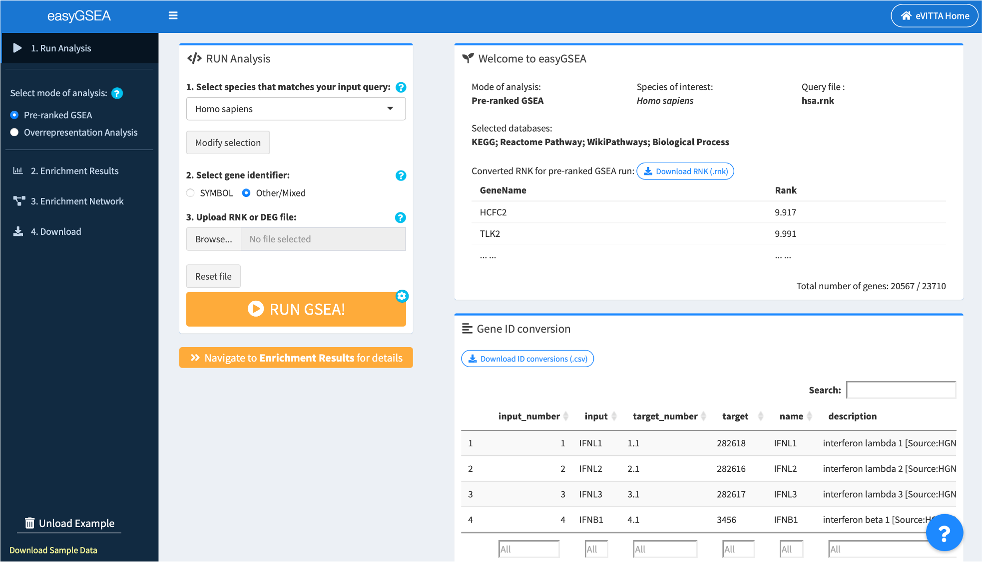
easyGSEA functionally characterize transcriptomes with integrative gene annotation (gene set, GS) databases. All essential analysis steps are performed in tab 1. Run Analysis.
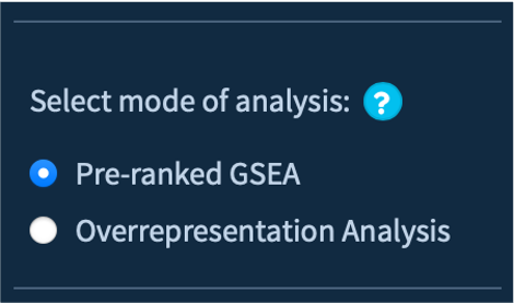
1.1. Select mode of analysis
To start, select either Pre-ranked GSEA or Overrepresentation analysis in the side bar.
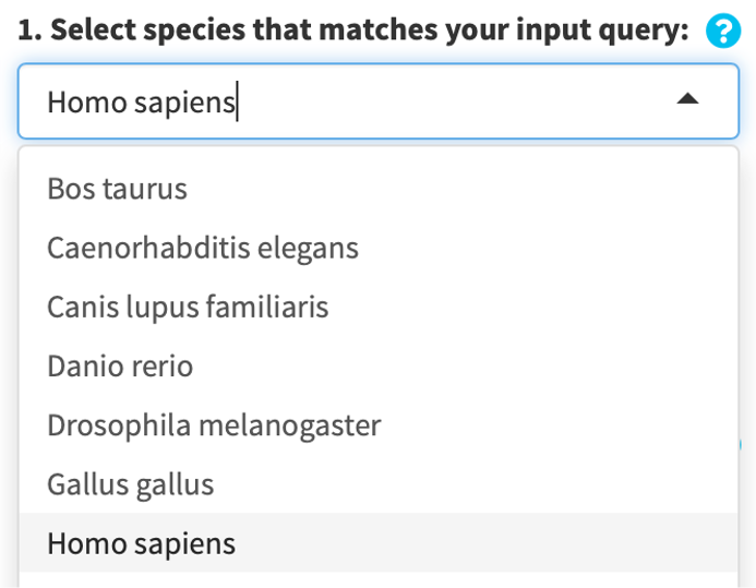
1.2. Select species
easyGSEA supports 11 different species, search and select the one that matches your input query.
Alternatively, you can click on Custom analysis and upload your own gene set (GS) library files (in GMT format, see above) to use the easyGSEA workflow for customized analysis.
- Upload limit: 300MB maximum per session
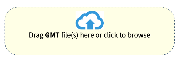
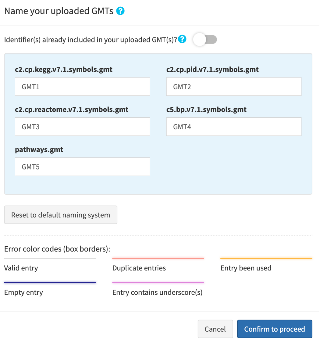
When you upload your own GS libraries (*.gmt), you will prompted to name each library with an identifier. Each uploaded file must be named with a unique identifier. The identifiers will be used to stratify your results by files later on.
By default, the uploaded are labelled by “GMT*”, where * is a number such as 1; the number automatically increments when you upload more.
If you specify that your .gmt files already contains an identifier, the string before the occurrence of a “_” in the first GS is subtracted to denote the GS library.
1.3. (Optional) Select gene set (GS) database(s)
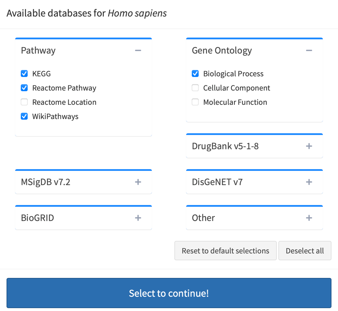
Click Advanced database options …. By default, easyGSEA has pre-selected combinatory biological pathway (KEGG, Reactome Pathway, Wikipathways) and process (Biological Process) for functional profiling. You may adjust the selections to suit your study purpose in the pop-up window as shown on the right. Once you have confirmed your database selections, click Select to continue!
1.4. Select gene identifier
Click Confirm to proceed to confirm your GS database selection or uploads.
easyGSEA maintains gene set databases according to HUGO Gene Nomenclature, where a gene "symbol" is a unique abbreviation for the gene name. If your query genes are symbols, select SYMBOLS. Otherwise, select Other/Mixed.

1.5. Upload/Input your data
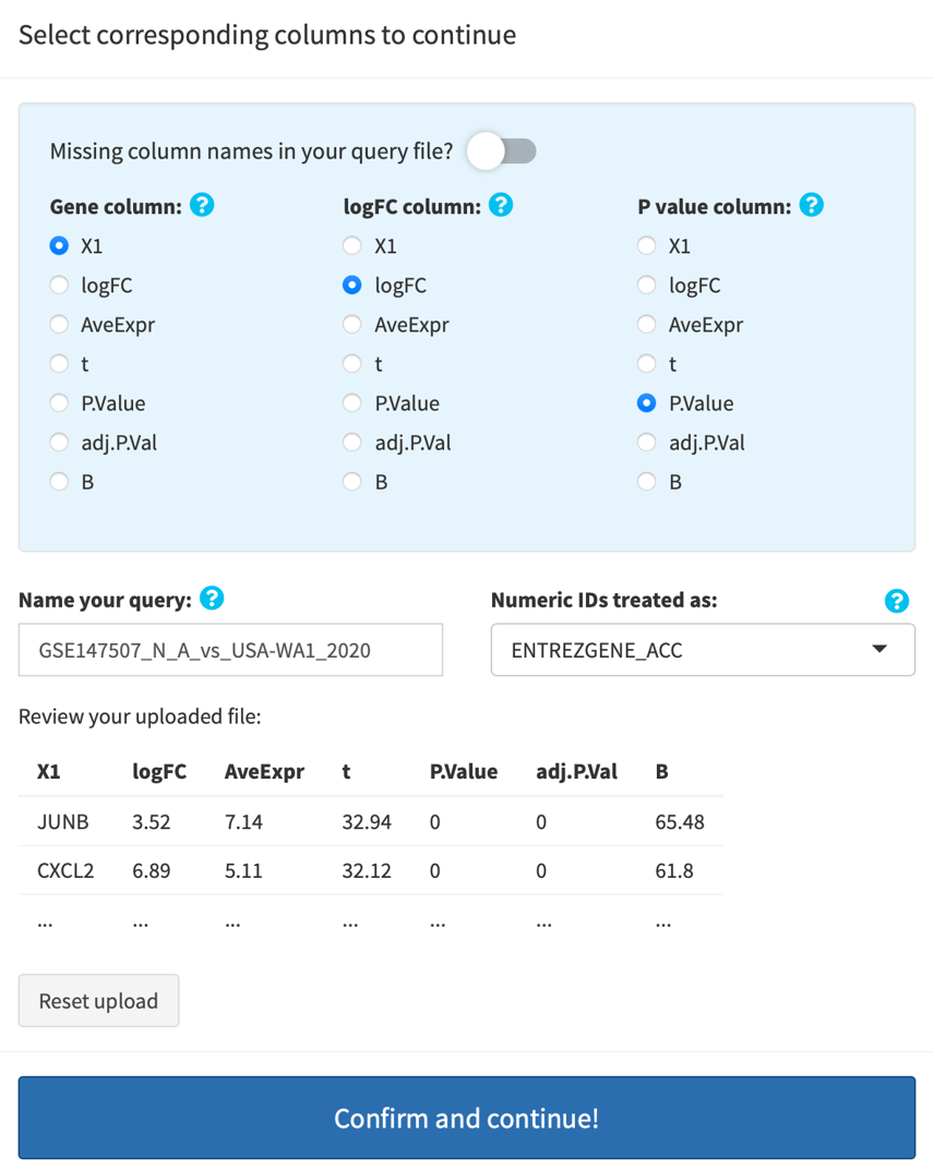
GSEA mode: upload either an RNK or a DE file (see above INPUT FILES/FORMATS). Once your file is uploaded, you will be prompted to specify the columns in your file: if RNK, specify the Gene and the Rank columns; if DE, specify the Gene, the logFC, and the P-value columns. By default, your query is named using your query file's name. You can re-name it by modifying the text. All results/figures you're going to download will be named according to your input here.
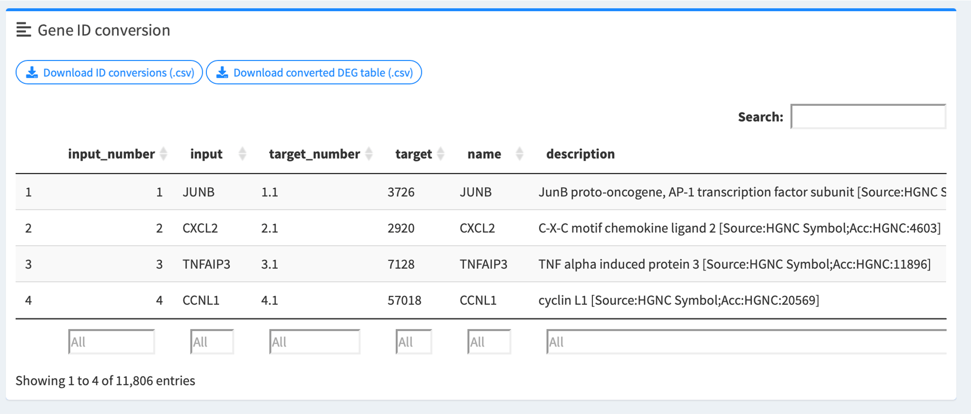
You will also need specify the gene identifier for fully numeric IDs. The default is NCBI Entrez gene IDs, but if you are analyzing array data, make sure select the corresponding platform. Then, your query genes will be automatically converted into symbols and you will have be able to download the converted gene/rank/DE tables after successful ID conversion.
Click Confirm and continue! to upload your file. Gene identifier conversion, if needed, is automatically done.
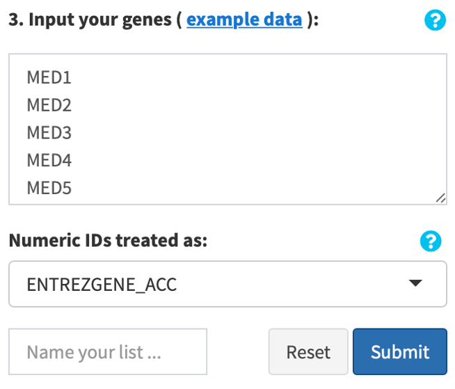
ORA mode: copy and paste your genes or proteins of interest, delimited by newline (“\n”), tab (“\t”) or space (“ “), into the text box provided in the interface. Select the identifier for numeric IDs (if any) as above. Enter a name for your list. Click Confirm. Your input genes/proteins will be loaded, and automatically converted to symbols, if applicable.
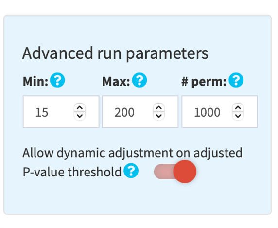
1.6. (Optional) Adjust run parameters
You may adjust the parameters for functional profiling analysis by clicking the sky blue gear button on top right of the orange run button.
By default, a minimum size of 15 and a maximum size of 200 is used to filter GSs. In the GSEA module, a default value of 1,000 (maximum 10,000) is used for permutations.
By default, a P-value threshold of 0.005 is applied to filter significantly enriched GSs.
In addition, by default, a threshold on adjusted P-value (padj) is applied for generating visualizations:
- .25, if at least 5 GSs meet the threshold, i.e. padj < .25
- .01, .05, .075, .1 or .25, if at least 50 GSs meet the corresponding threshold
Click the switch button to disable this dynamic threshold adjustment.
1.7. (Optional) Review gene ID conversion table
easyGSEA will provide you with an ID conversion table if your input genes are not symbols. In the GSEA module, if your uploaded file is DE and your genes are not symbols, easyGSEA will generate a converted DE table for you to pass to easyVizR for multiple comparisons.
1.8. Click RUN GSEA! or RUN ORA! to perform functional profiling analysis
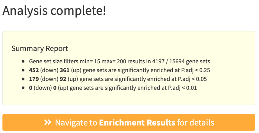
A summary pop-up window will appear after a successful run, summarizing GS filters and number of significantly enriched GSs.
Click Navigate to Enrichment Results for details.
Step 2: Explore Enrichment Results
easyGSEA provides a variety of interactive, customizable and publication-ready figures to visualize the enrichment results. Enrichment plot and statistics for each gene set can be easily retrieved by clicking the plots or by keyword search. We also provide a variaty of visualizations for you to explore the trends of your data as compared to the whole genome backgroud: Density, box and violin plots. You can also zoom into biological pathways (KEGG, Reactome, Wikipathways) to inspect the gene level changes.
2.1 Examining the enrichment results using different visualizations
Click top left buttons on this page to explore different visualizations on your data. Bar plot, Bubble plot, Manhatten plot and Volcano plot display gene sets that are significantly enriched in your datasets. Keywords does simple text mining and discribes the most frequent words in your enrichment results. All visualizations are customizable as explained below.
Color options: Red, Salmon , Blue, Cyan , Orange, Green , Purple, Grey
-
Interactive bar plot
Top enriched GSs are plotted along the y-axis. In GSEA runs, enrichment scores (ESs) are plotted along the x-axis; in ORA runs, -log10 transformed P-values (pval) (-log10(pval)) are plotted along the x-axis. The color intensity reflects the -log10(pval/padj)*sign(ES) (GSEA module) or -log10(pval) (ORA module), as annotated by the color bar. Hover labels show the statistical information of each GS including its name, pval, padj, and leading-edge (GSEA module) or overlapping (ORA module) genes.
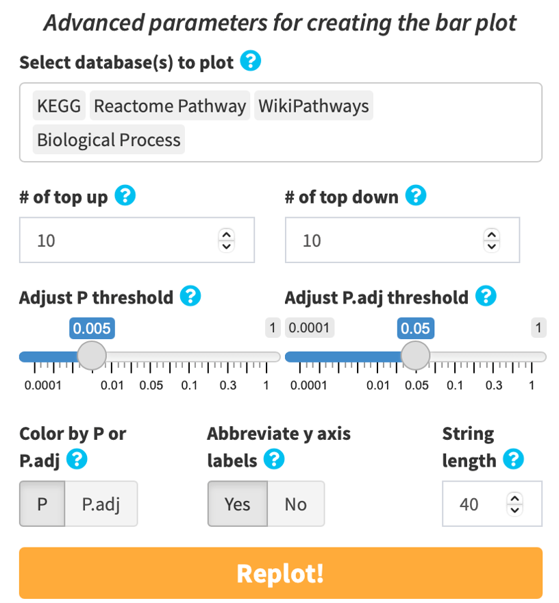
By default, results from all analyzed databases are displayed. Default P-value (pval) threshold is < 0.005. Default adjusted P-value (padj) is dynamically adjusted depending on the user-supplied dataset to i) capture the most significantly enriched categories, and ii) minimize false positives arising from overreliance on a single gene set library: 0.25 if 5 or more gene sets have an padj < 0.25; 0.05 if 20 or more have an padj < 0.05; and 0.01 if 20 or more have an padj < 0.01. Click the gear button on top right of the RUN button to switch to FALSE to disable dynamic adjustment if you have multiple datasets to analyze and would like to be consistent in padj threshold. You may choose to color the plot by pval or padj. The y-axis labels are abbreviated to 40 characters by default for aesthetic purposes. You may choose to display the labels in full or adjust the number of characters to abbreviate.
Alternatively, you can manually search and select the gene sets of interest to visualize by clicking the search icon. Click the palette icon to customize bar colors. Click the TV icon to remove/add database identifiers and/or GS IDs (if any).
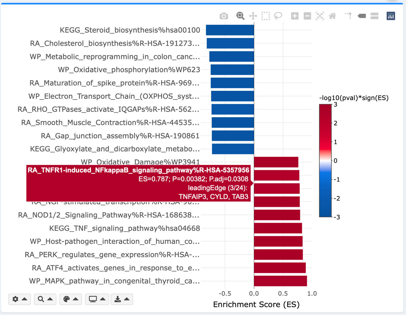
Bar plot, and every individual visualization in eVITTA can be customized with its own plotting parameters. For example:
- Adjust the database(s) to include in the plot
- Adjust P-value (pval) and adjusted P-value (padj) thresholds
- Manually select GSs to include in the plot
- Adjust colors
- Adjust label texts
Interactive bubble plot
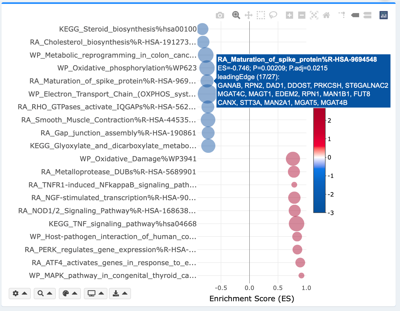
x- and y-axis, and plotting parameters are mostly identical to the above bar plot. Additional parameters are adjustable minimum and maximum bubble sizes for aesthetic purposes. Bubble size reflects number of leading-edge (GSEA module) or overlapping (ORA module) genes.
Interactive keyword plot
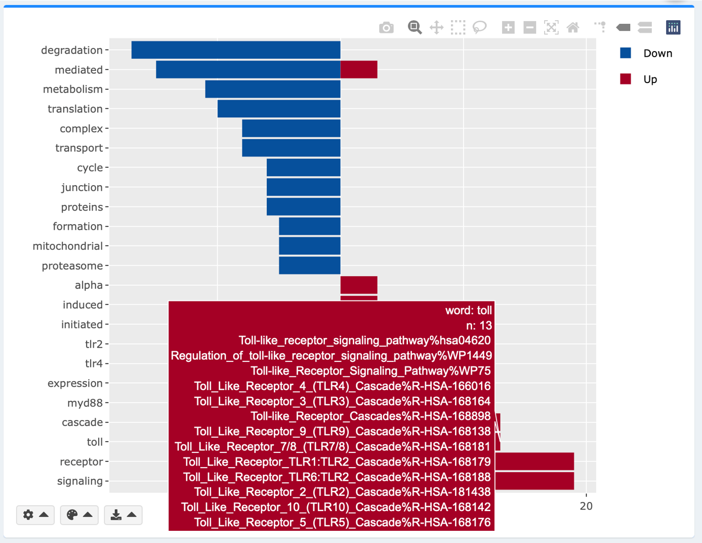
Simple text mining is done to extract the top frequently appearing words in the enriched gene sets. Hover over each word for the underlying gene sets. pval, padj and colors are adjustable as in the bar and the bubble plots. Adjust the number of top appearing words to display by clicking the gear button.
Interactive Manhatten plot
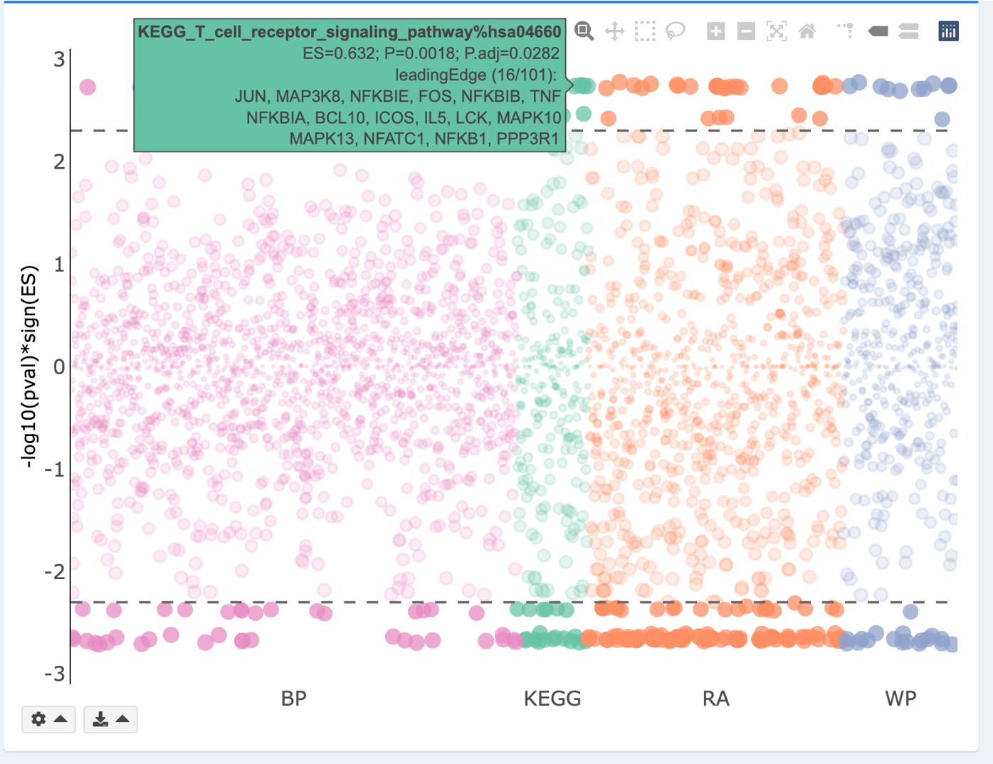
Manhattan plot displays enrichment results on all tested gene sets. Each GS library is uniquely colored and plotted along the x-axis. -log10(pval/padj) for each GS is plotted along the y-axis. Significantly enriched gene sets, as defined by the chosen pval or padj threshold, are highlighted with stronger colors. Horizontal dashed line reflects the threshold of pval or padj. Hover labels show the statistical information of each GS.
Volcano plot
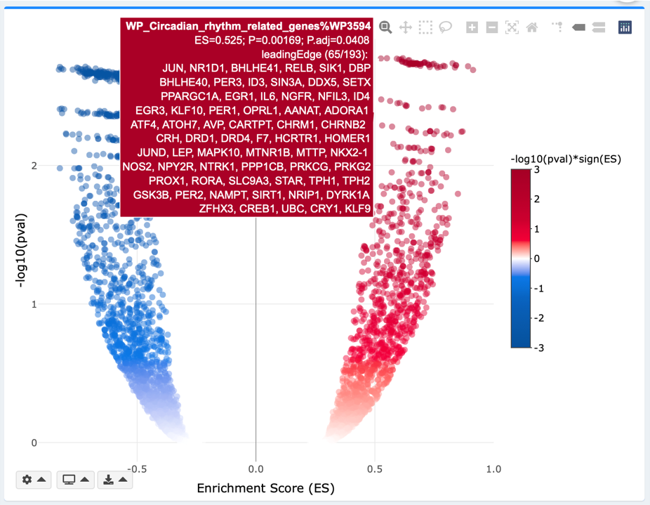
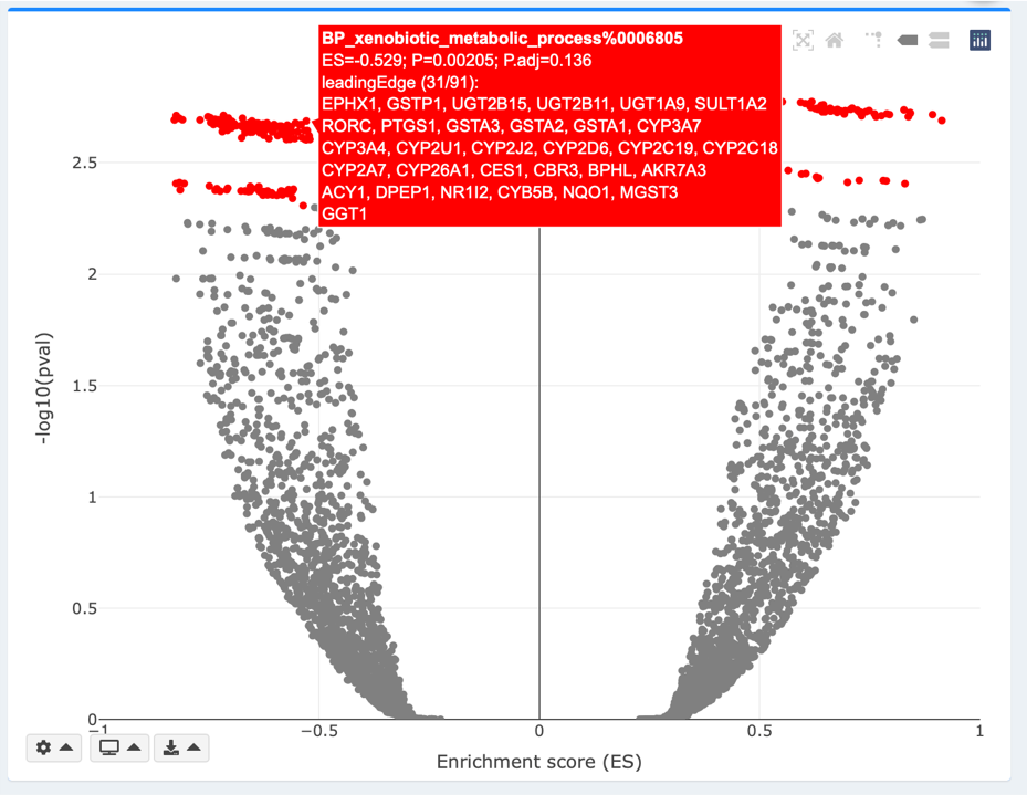
ESs are plotted along the x-axis. -log10(pval/padj) for each GS is plotted along the y-axis. You may adjust the pval or padj threshold using the gear dropdown on bottom left of the plot. In the Continuous mode, the color intensity reflects strengths of regulation (-log10(pval/padj)*sign(ES)). In the Discrete mode, GSs that meet pval or padj threshold are highlighted in red. Both continuous and discrete volcanos are interactive, where hover labels show details about each gene’s name, logFC, and padj. In the Static mode, GSs that meet the pval/padj threshold are highlighted and labelled with their names.
2.2. Explore individual gene set (GS) statistics
Click the interactive plots, or manually search the GS you are interested to zoom into its detailed statistics. easyGSEA provides options on visualize the distribution of ES scores of a selected GS in the genome background.
Enrichment plot (GSEA module only)
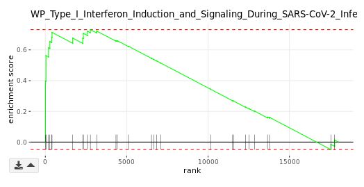
The primary result of GSEA is the enrichment score (ES), which reflects the degree to which a gene set is overrepresented at the top or bottom of a ranked list of genes. The enrichment plot provides a graphical view of the ES for a gene set. The score at the peak of the plot (the score furthest from 0.0) is the ES for the gene set. Gene sets with a distinct peak at the beginning (such as the one shown here) or end of the ranked list are generally the most interesting. The leading edge genesare the subset of members that contribute most to the ES. For a positive ES, the leading edge genes are the set of members that appear in the ranked list prior to the peak score. For a negative ES, they are the set of members that appear subsequent to the peak score.
Summary table
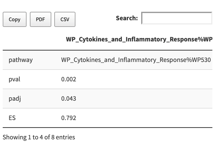
The detailed enrichment statistics about a GS are provided in a copiable and dowloadable table.
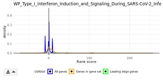
Density plot (GSEA module only)
The rank scores in bins of all genes (blue) and genes in a selected GS (orange) are plotted along the x-axis. The density (frequency) of each rank score bin is plotted along the y-axis. The leading-edge genes are plotted as dots (green) based on their rank scores.
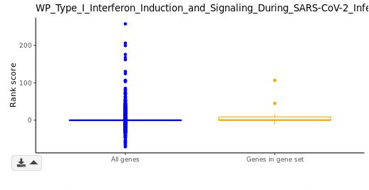
Box plot (GSEA module only)
Distributions of rank scores for the genome background (blue) and a selected GSs (orange) are plotted along the y-axis. In violin plots, standard deviations (s.d.) are indicated with grey perpendicular lines. You may adjust the number of s.d. to display using the gear dropdown on bottom left of the violin plot.
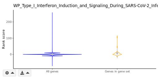
Violin plot (GSEA module only)
Similar to the above box plot, distributions of rank scores for the genome background (blue) and a selected GSs (orange) are plotted along the y-axis. Standard deviations (s.d.) are indicated with grey perpendicular lines. You may adjust the number of s.d. to display using the gear dropdown on bottom left of the violin plot.
2.3. Visualize a pathway
You can visualze biological pathways (KEGG, Reactome, Wikipathways) by clicking/selecting corresponding gene set and scroll down to the bottom of the page. Genes are colored according to their ranks in your dataset.
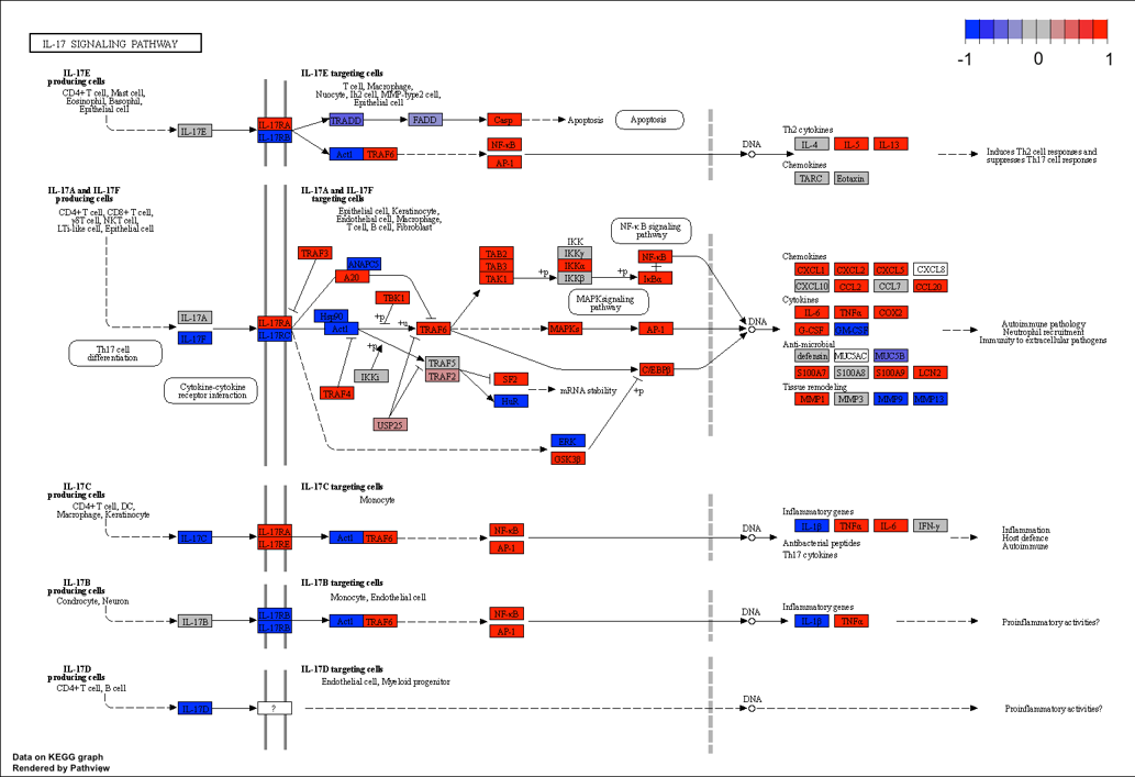
KEGG diagram
In GSEA runs, upregulated genes are colored in red, while downregulated genes are colored in blue. Color intensity reflects strength of regulation. In ORA runs, overlap genes in both the user-suppplied gene list and the pathway are highlighted in green.
Reactome diagram (interactive)
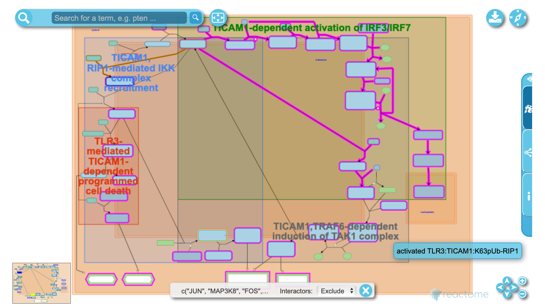
In GSEA runs, leading edge genes are highlighted in red. In ORA runs, overlap genes are highlighted in red. All reactome diagrams are interactive. Click on the nodes (subset of reactions, genes, enzymes, substrates, products, etc.) and edges (interactions, genetic or physical) to learn more.
Wikipathways diagram
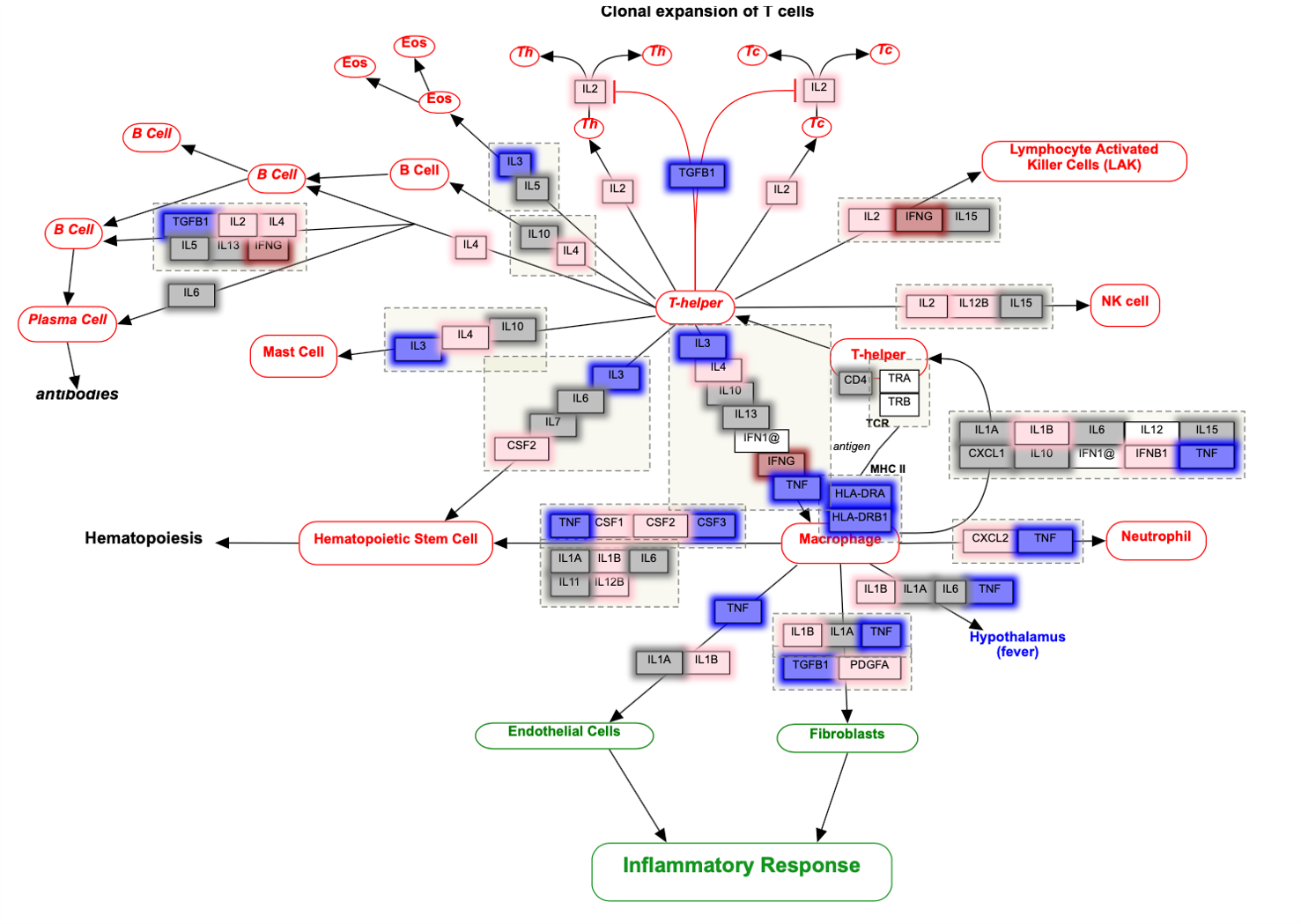
In GSEA runs, upregulated genes are colored in red, while downregulated genes are colored in blue. Color intensity reflects strength of regulation. In ORA runs, overlap genes in both the user-suppplied gene list and the pathway are highlighted in green. All Wikipathways diagrams are interactive. Click on the each node (gene) to learn more about its definition and functions.
2.4 Customize plots to generate publication-ready figures
Each plot can be customized as you need. For example, you can easily select/deselect databases, adjust P and P.adj thresholds, adjust the number of top regulations to display, and modify artistic appearance of the figures (e.g. string length, bubble sizes).
2.5 Download plots
Download the customized plots to your local drive for long-term storage purposes.
Step 3: Visualize enrichment results in a network
Gene sets (GSs) sometimes can be redundant. A network view is helpful to group GSs that probably describe similar biology, and/or examine relations between GSs.
3.1. Explore network view of enriched gene sets
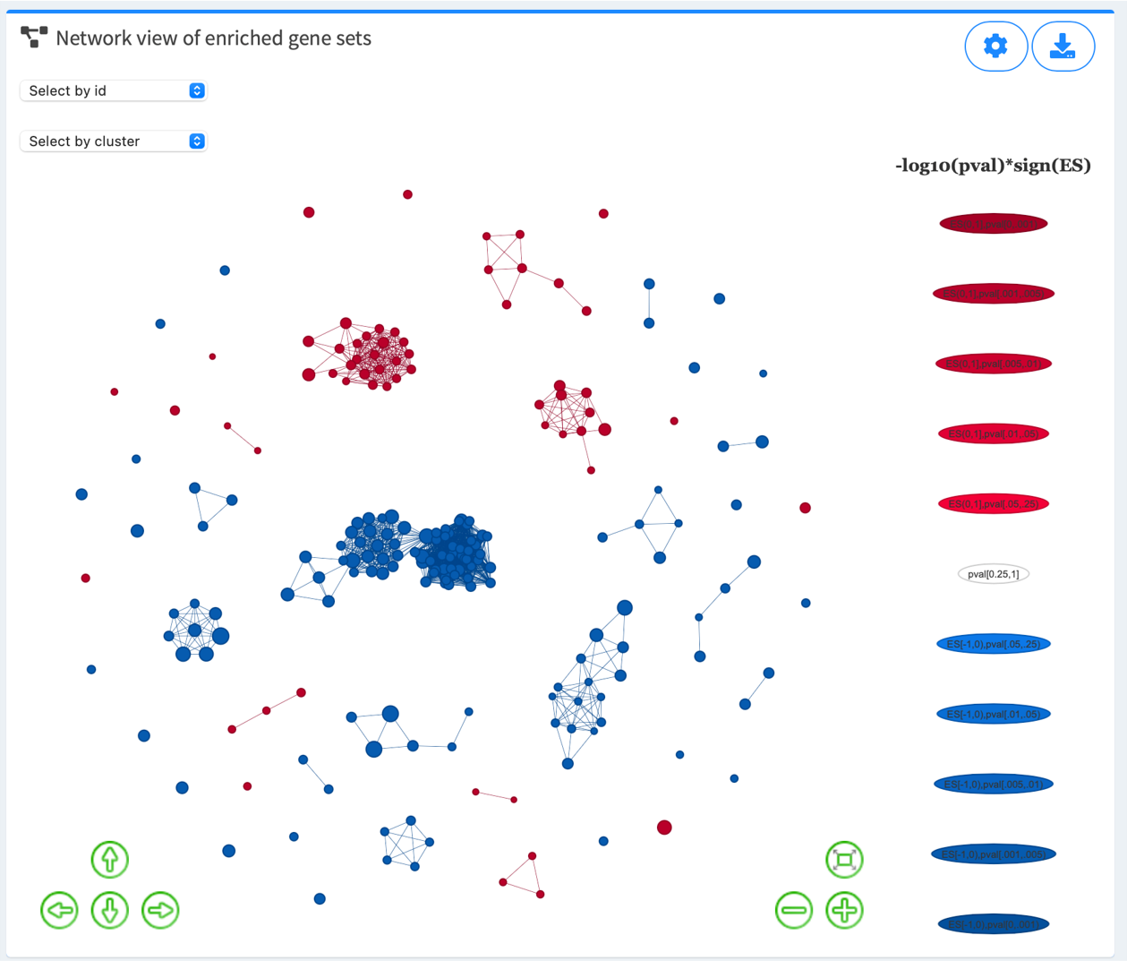
Node denotes GS. Node size reflects the number of leading-edge genes (GSEA module), overlapping genes (ORA module), or genes in the original database. Node color intensity reflects strength of regulation (-log10(pval/padj)*sign(ES)). Edge reflects significant gene overlap between GSs as defined by Jaccard (the default), overlap, or combined coefficient. Hover over each node and edge for detailed statistical information about each GS and its relationship with other GSs.
Color options: Red, Salmon , Blue, Cyan , Orange, Green , Purple, Grey
3.2. Adjust advanced parameters to fine tune the network view
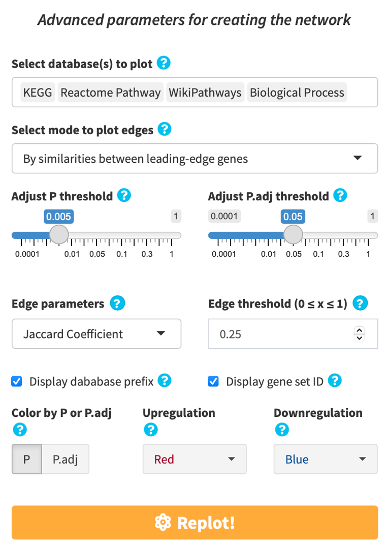
If you find the enriched GSs are too connected or too disconnected with each other, or if there are too many/few GSs in the defined thresholds, or if you’d like to adjust the method of plotting edges, click the gear button on top right and adjust the plotting parameters to fine tune the network view.
3.3. GS clusters
We provide means to cluster GSs according to their similarities, and offer different visualizations to help you interpret the enriched GSs.
-
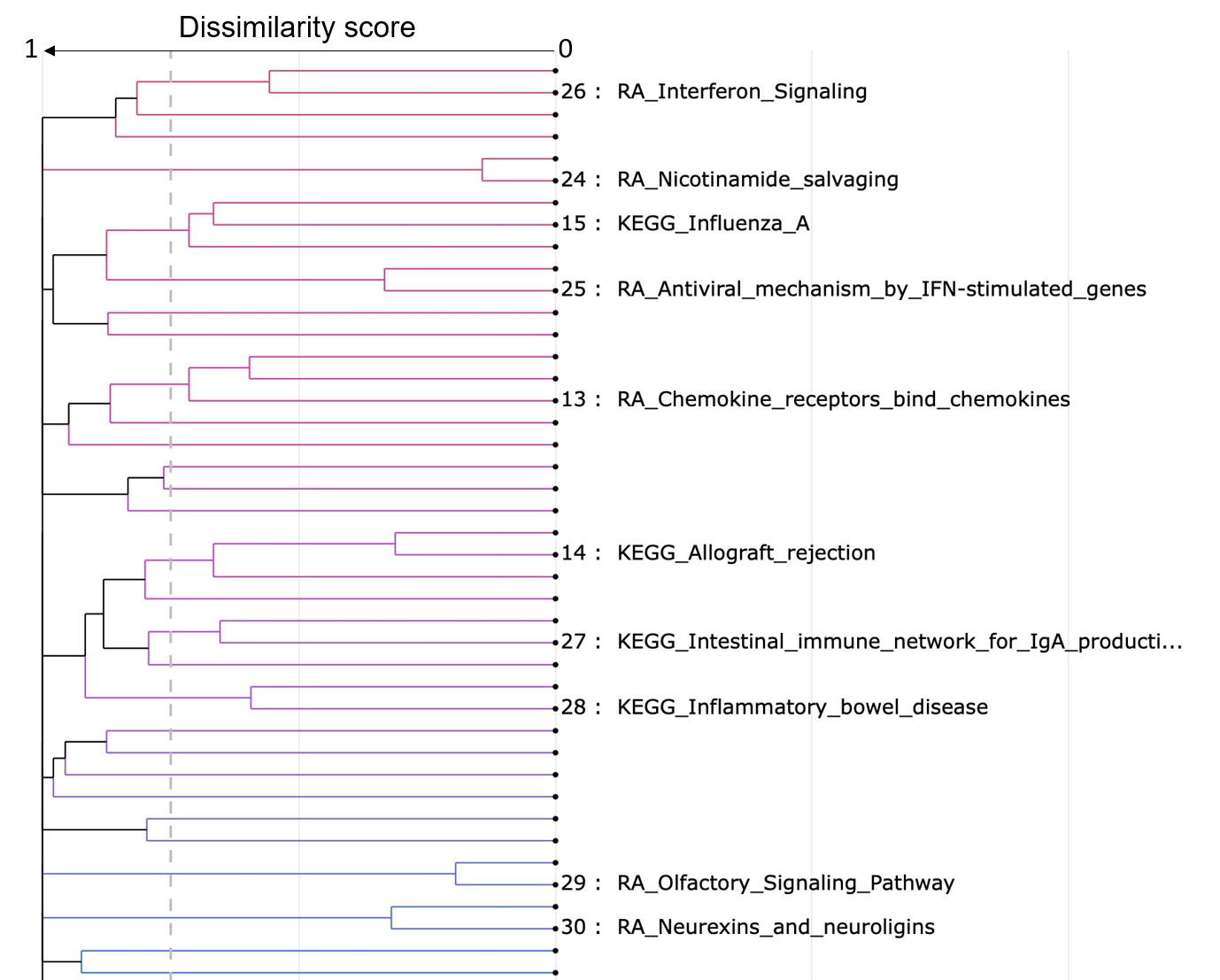
Cluster dendrogram
- Gene sets that have a similarity score larger than or equal to the similarity threshold are grouped together.
- The text size can be adjusted to help you to see all the label clearly.
- The minimum size of a cluster can be adjusted to help you to see the labels of larger clusters. The clusters that have at least z gene sets are labeled.
-
Cluster barplot
-
Cluster bubble plot
-
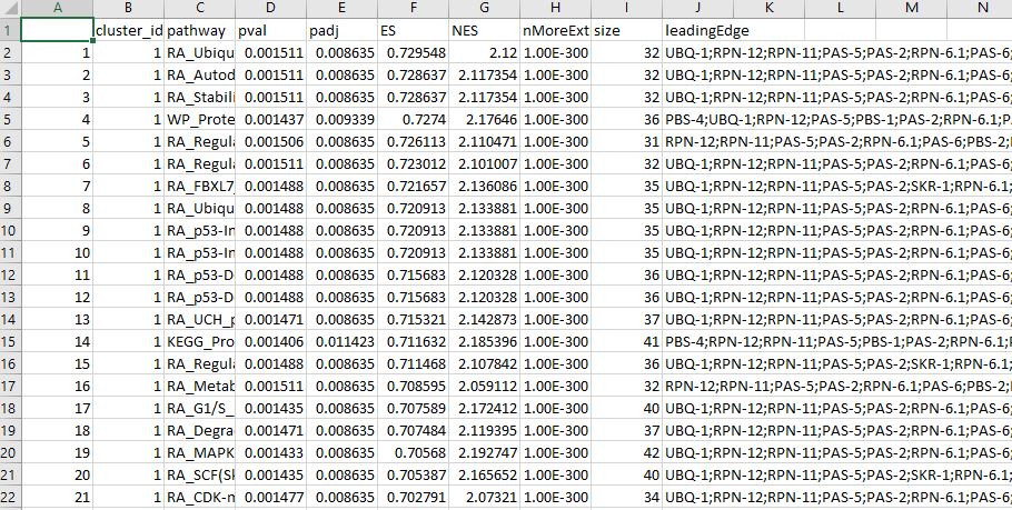
Cluster table
Similarity scores (as defined by Jaccard, Overlap or Combined coefficients) between gene sets are converted into a distance (dissimilarity) matrix. Hierarchical clustering using the complete method is performed and a similarity threshold (default 0.25) is used to group gene sets that probably describe similar biology. The most significantly enriched gene set (lowest padj) is chosen to annotate the cluster it occurs in.
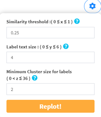
Node denotes gene set, height denotes dissimilarity score, dashed line denotes the similarity threshold. Hover over each node for the gene set name. The similarity threshold, label text size, and minimum cluster size for labels are all customizable for a best way to summarize your data.
Dendrogram dropdown menu
You could make some adjustments to the dendrogram using the dendrogram dropdown menu.
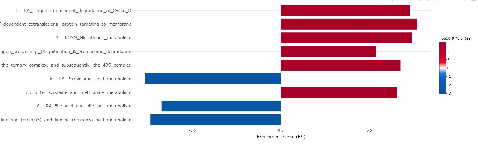
The most significant gene set in each cluster are plotted in bars. They can be sorted either by cluster sizes (1 to the largest), or ES in GSEA and pval/padj in ORA.
As in above bar plot, the most significant gene set in each cluster are plotted in bubbles. They can be sorted either by cluster sizes (1 to the largest), or ES in GSEA and pval/padj in ORA.

The table showing the clustering statistics can be downloaded for record and detailed examination.
3.4 Download plot
Click the download button and save the plot you need.
Step 4: Download Enrichment Table and Gene Set Libraries
Download the enrichment table for multiple comparisons in easyVizR. All gene set libraries in easyGSEA are also available for download for custom analysis and/or tool development.
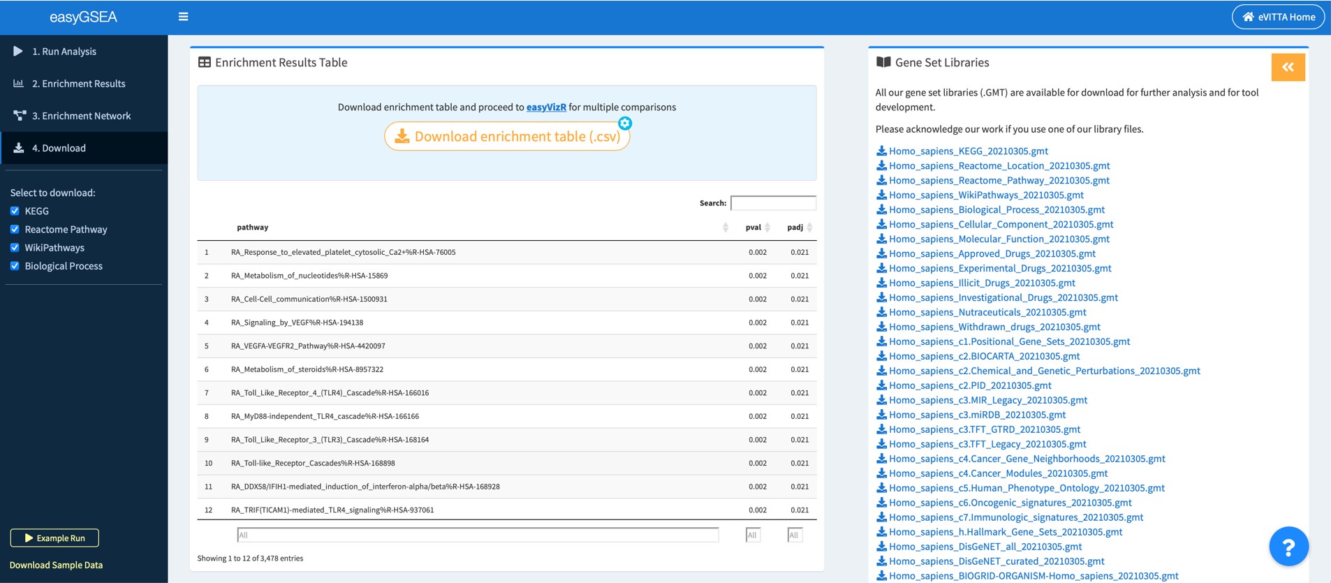
4.1 Download enrichment table and explore more
You may download the enrichment table and proceed to easyVizR for multiple comparisons. You may also explore details about the enrichment results on your local drive.
4.2 Download our gene set libraries for customized analysis and/or further tool development
You may use our up-to-date gene set libraries to help with your analysis (if any) and/or for further tool development.
Support
Feel free to reach us at evitta@cmmt.ubc.ca if you have any questions.
Known issues
- Safari users: for the plotly interactive graphs, the top right "download as png" button might not work. This is a bug within plotly itself. Please download as html or take a screenshot instead.