easyVizR User Guide
easyVizR (read: easy-vise-R) provides various visualization modules designed for comparing and making inferences from multiple sets of expression data.
Demo sessionIntroduction
Multiple comparisons play a crucial role in research into complex regulatory networks. Oftentimes, multiple genotypes are profiled in parallel, and identifying the overlaps and disjoints among differential expression profiles is important to uncover functional dysregulations following a genetic perturbation. Even when multi-factored, multi-leveled study designs are not involved, it is increasingly standard for researchers to compare new results to published data.
To streamline the exploration of multiple datasets, easyVizR integrates list filtering, intersection selection, and visualization in the same workflow. At any time, one can change the filters or the selected intersection, and the graphs will be updated dynamically to reflect the new parameters. This flexible workflow allows for rapid discovery of patterns that underlie common and divergent regulations in any number of datasets.
easyVizR's workflow consists of four steps:
- Upload files
- Select datasets and set up filters
- Select intersections of interest
- Visualization
Supported input types
easyVizR accepts comma-delimited data tables (*.csv) as input. Each input data table must contain four essential columns:
- Gene identifiers or annotations;
- A differential expression metric (e.g. logFC / enrichment score);
- Statistical significance (e.g. p-value);
- Adjusted statistical significance (e.g. FDR/ adjusted p-value).
In easyVizR, these four columns are referred to as “Name”, “Value”, “PValue” and “FDR”, respectively.
Supported input types includes but is not limited to the following:
- Outputs from differential expression analysis tools (e.g. easyGEO)
- Gene set enrichment results (e.g. GSEA/ ORA) from functional profiling tools (e.g. easyGSEA)
Note that it is strongly recommended to use the whole dataset without any cutoffs or filters. You can apply filters in the visualization interface, which will be reflected dynamically in the visualizations. Take advantage of this reactivity to interrogate the data in greater depth.
Step 1: Upload files
Input format
As specified above, the input dataframe should have at least four columns: Name, Stat (the main statistic, e.g. logFC), PValue, FDR. A minimal example looks like this:
| Name | logFC | PValue | FDR |
|---|---|---|---|
| 2L52.1 | -0.26 | 0.63 | 1 |
| aagr-1 | -0.36 | 0.25 | 1 |
| aagr-2 | -0.21 | 0.37 | 1 |
| aagr-3 | -0.21 | 0.40 | 1 |
| aagr-4 | 0.78 | 0.03 | 1 |
Currently, both PValue and FDR columns are required. If your data only has one of these columns, you can bypass this requirement by manually duplicating the available column, and avoiding to use the duplicated column in visualizations (NOT RECOMMENDED).
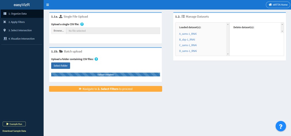
1.1a Single File Upload
You can upload a single .txt or .csv file (comma separated).
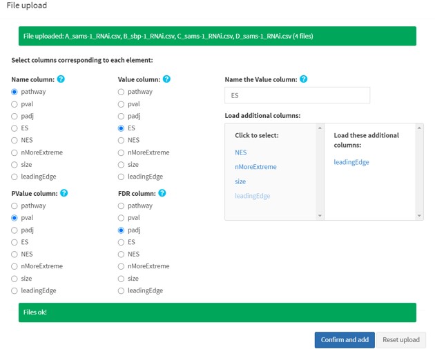
For each upload, you will be asked to specify the following things:
- Select the correct columns for each required field
- Name the dataset (Default: the file name)
- Name the Value column
- Load additional columns (these used in certain visualizations; for GSEA outputs, “leadingEdge” column is automatically loaded.)
1.1b Batch upload
Select a folder containing multiple .txt or .csv files (comma separated).
- All the files must have the same column names. Files having different column names will be omitted. If that happens, you can either change the column names, or upload them one by one through single file upload.
Upload limit
Large dataframes can eat up resources on the server side and lengthen the processing time. To prevent this, user uploads are limited to the following:
- Single file upload: max 10 MB per upload
- Batch file upload: max 50 MB per upload
- Total file storage per session: 100 MB
1.2 Manage datasets
Here you can select and delete datasets that are no longer needed.
- It is recommended to delete unused datasets from memory, especially when working with large datasets involving differentially expressed genes.
Step 2: Select datasets and set up filters
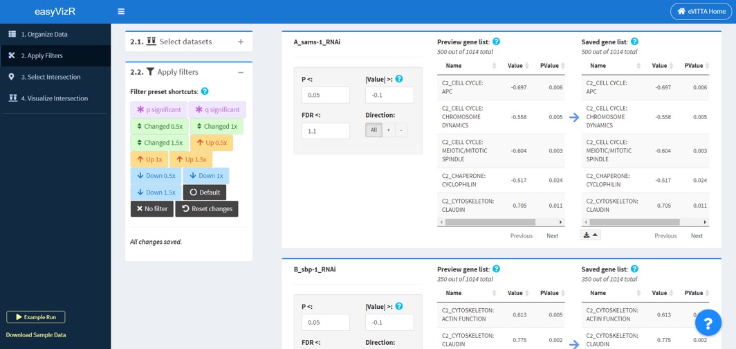
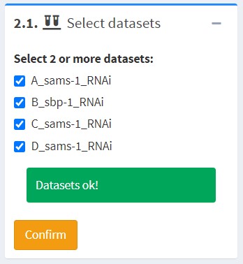
2.1 Select Datasets
Select two or more datasets for comparison. The datasets selected must share at least one identifier.
After datasets are selected, their expression tables will be horizontally merged into a master data-frame, with column names in the format “XXX_NNNNN” (where XXX denotes the column name, e.g. Value, and NNNNN denotes the name of the dataset).
- If an identifier is found in dataset A but not in dataset B, it will be displayed as blank(NA values) in columns corresponding to dataset B. It will be excluded from any gene lists generated from dataset B.
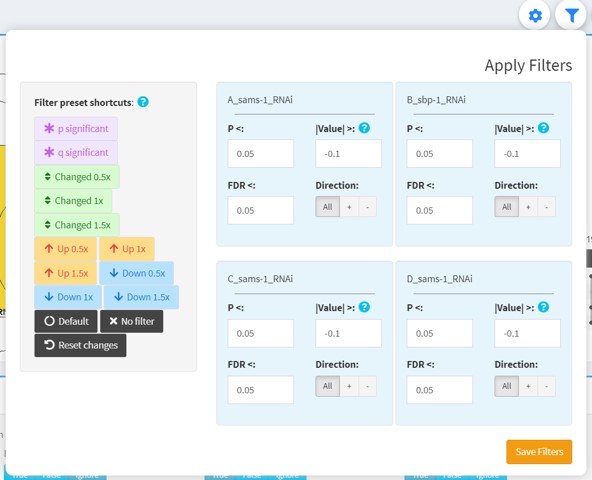
2.2 Apply Filters
After selecting datasets, the user must apply filters to each dataset to generate gene lists. Conventionally, the gene list contains genes that are “significantly changed” according to a set of cutoffs. These gene lists are then used for intersection analysis.
There are two methods to apply desired filters:
- Detailed filtering panels for each dataset are shown on the right.
- Filter preset shortcuts are shown on the left in the Apply Filters panel. These are a quick way to apply filters globally to all datasets.
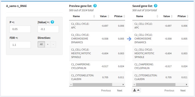
Detailed filtering panels
Enter your filters in the filter inputs.
- Preview gene list will show you the list of "significantly changed" terms according to the current input values. This is dynamic and will change when you change the filters. Compare this to the saved gene list when choosing filters.
- Saved gene list shows the list of "significantly changed" terms according to the saved filters. This is static, and will only change when you save the filters. .
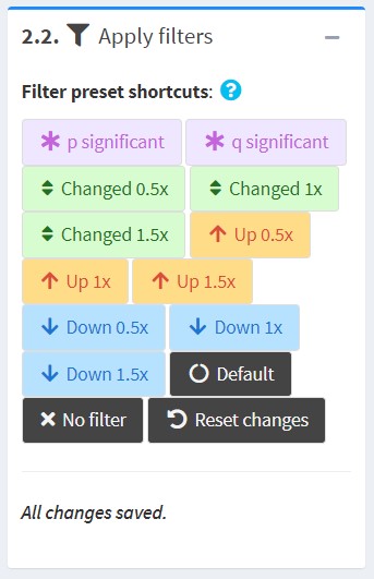
Filter preset shortcuts
Some commonly used filtering strategies are provided as presets. Hover over each button to see the effects.
- When you click a button, it will be applied to all datasets and overwrite your changes.
- Most presets only change one or two fields; thus, the effects are stackable. (e.g. if you want the filters to be p<0.05 and FDR<0.05, simply click “p significant" and then “q significant".)
- Filters use “<” rather than “<=”: e.g. a p filter of 1 will still exclude entries with p=1. To completely remove a filter, set it above the maximum possible value, e.g. use a p filter of 1.1.
Saving filters
If you have unsaved changes, the filter inputs will glow red, and a text reminder will pop up on the bottom left.
Click the Save Filters button to save them. This will also update the Preview gene list table into the Saved gene list table.
Step 3: Select intersection
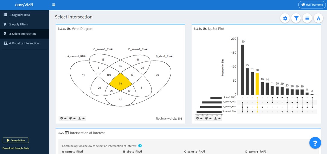
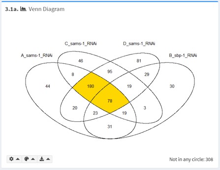
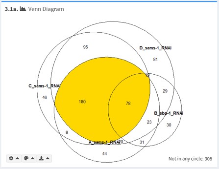
3.1a Venn Diagram
For a small number of gene lists (n < 6), the Venn Diagram is useful for visualizing intersections between gene lists.
Users can toggle between two versions of the diagram:
- Basic renders a non-area-proportional Venn diagram with VennDiagram. However, with n>4, this plot may become convoluted.
- Area-proportional renders an area-proportional euler diagram with eulerr. Note: with n>3, some intersections may fail to render.
The number of terms not included in any gene list is shown on the bottom right.
By default, the intersection currently selected in Intersection of Interest is highlighted.
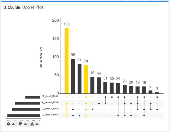
UpSet Plot
For a small number of gene lists (n < 6), UpSet plot (rendered with UpSetR) is also provided.
In the UpSet plot, set sizes are presented in bar format. Thus, it is a useful alternative to Venn and euler diagrams when they become uninformative.
By default, the intersection currently selected in Intersection of Interest is highlighted.
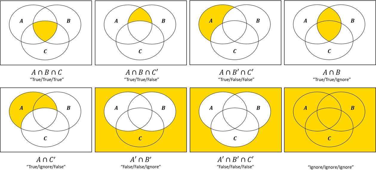
3.2 intersection of interest
Here you can select an intersection of interest to interrogate in further detail.
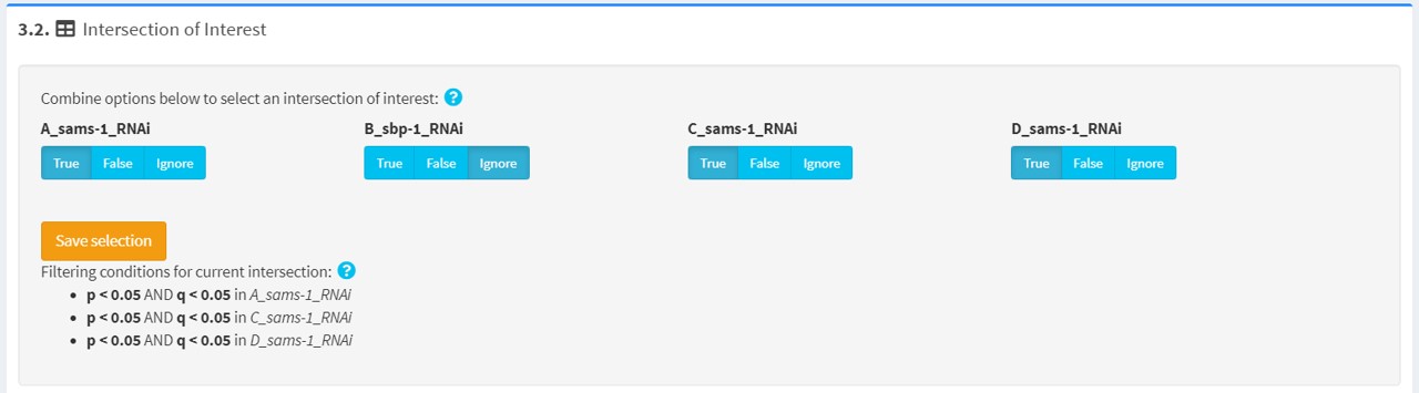
In the interface, “True”, “False” and “Ignore” options are provided for each filtered list to specify set relationships. The effects of each of these options are specified below:
| Option | Contained in the filtered gene list? | Satisfy the filters? | Represented in Venn Diagram |
|---|---|---|---|
| TRUE | YES | YES | included in the circle |
| FALSE | NO | NO | excluded from the circle |
| Ignore | may or may not | may or may not | may be included or excluded |
In terms of set operations, for filtered list A, with filter p<0.05:
- “True” refers to set A (everything included in A, i.e. everything with p<0.05)
- “False” refers to the complement A’ (i.e. everything NOT in A, i.e. everything with p>=0.05, OR empty values)
- “Ignore” means no set operation on A
The set operations are linked by “AND”. We do not currently support “OR”.
Combining these options for multiple filtered lists allows one to build a set operation that points to a particular intersection.
For instance, for three filtered lists A, B, C, the following selections are possible:
There are two ways you can verify that you have selected the correct intersection: 1) by comparing the number of rows in the table to the Venn counts, and 2) by checking the Active filters description.
Intersection table
Terms in the selected intersection are presented in the intersection table below.
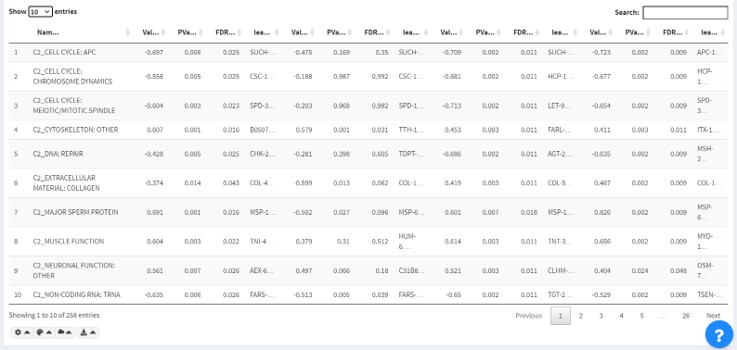
There are three available views:
- Full: shows all columns.
- Minimized: shows only the important columns (Value/ PValue/ FDR)
- T/F Matrix: shows if the terms satisfy the filters in "true"/"false".
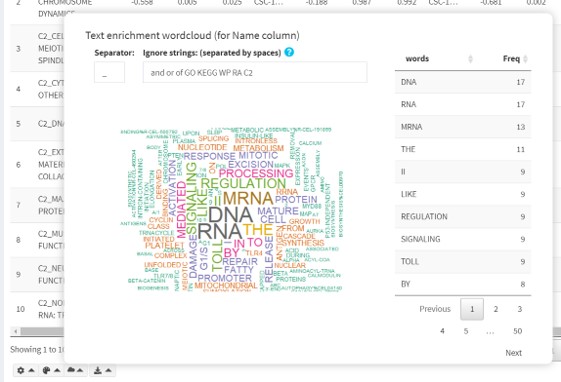
Text enrichment word cloud
The intersection table provides a text enrichment word cloud module. This module shows enriched words in the identifier column, which is especially useful for identifying recurring words in a set of functional categories.
- The algorithm splits identifiers into words according to the specified separator and tallies the occurrence of certain words.
- If at least one word occurs more than once, a word cloud is displayed, with sizes corresponding to the number of occurrences.
- This tool is may also be useful for gene symbols of certain organisms: for instance, using separator "-", and ignoring the REGEX "[[:digit:]]", the tool can tally the frequency of C. elegans genes with similar nomenclature.
NOTE: this widget should not be used for rigorous analysis. It has lots of flaws, e.g.:
- Enrichment might be biased towards words already overrepresented in the database;
- Spelling/ tense variations are counted as separate words;
- Low frequency words that do not fit into the diagram are silently omitted by the algorithm.
Data and filter options
Data and filter options are available as widgets on top right of the page.
There are four buttons:
- Options for easyGSEA output
- Apply filters
- View filtered gene lists
- Enter genes of interest

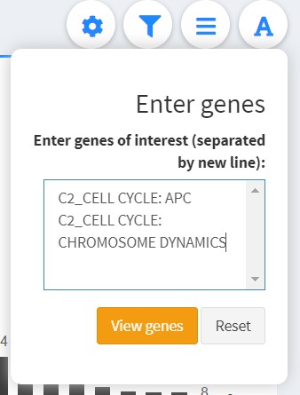
Enter genes of interest
If you have specific genes or annotations in mind, open the dropdown and enter them here.
- Each identifier is separated by a new line;
- This is case-insensitive, but the string must match exactly.
Select View genes to view the specified genes or annotations. Click Reset to revert to the original view.
If the selected genes or annotations do not fulfill the current filters, they will not be shown. Remove or change the filters to view all selected genes or annotations.
Apply filters
This dropdown is a minified version of the filter selection controls in Tab 2.
Use this to adjust the filters any time in the visualization tabs.
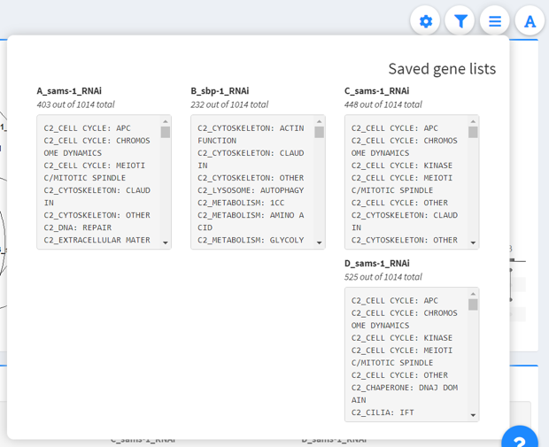
View filtered gene lists
This dropdown shows the filtered gene lists that are currently active.
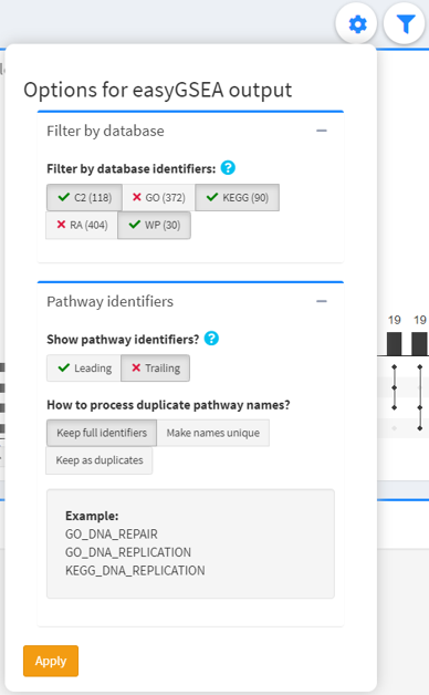
Options for easyGSEA output
This dropdown displays additional options for easyGSEA output.
Typical easyGSEA outputs have a leading identifier specifying the database (e.g. “KEGG_”) and a trailing identifier specifying the gene set ID (if applicable).
- Filter by database identifiers: only display terms that have a certain set of database identifiers.
- Pathway identifiers: additional options to show and hide leading and trailing identifiers, and options to handle duplicate names. The effects can be seen in the example below.
Step 4: Visualize intersection
By default, most of the visualizations are based on the currently selected intersection.
At any point, you can change the filters and select a different intersection, and the plots will be refreshed dynamically. This flexibility allows for rapid discovery of patterns that underlie common and divergent regulations in multiple datasets.
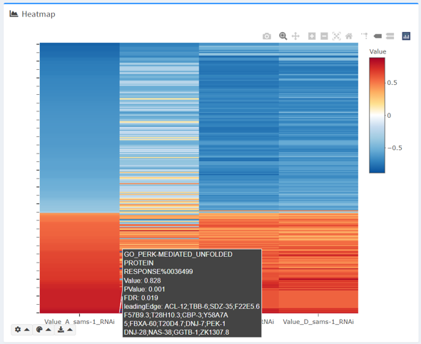
Heatmap
The interactive heatmap (rendered with plotly) visualizes how terms in the selected intersection are differentially regulated across datasets.
- By default, the differential expression metric (e.g. logFC or ES) is used, but users can also plot other numeric columns, as long as they are present across all datasets.
- The heatmap uses a divergent color scale centered upon 0, with red corresponding to a positive metric, and blue to a negative metric.
- You can hover over individual cells to see more details.
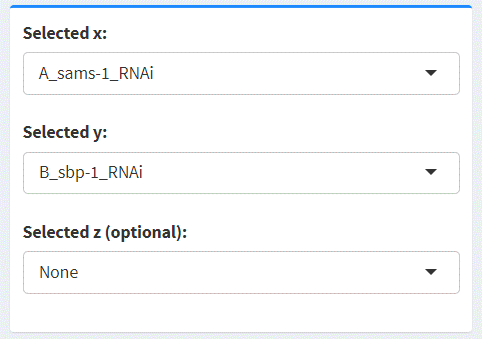
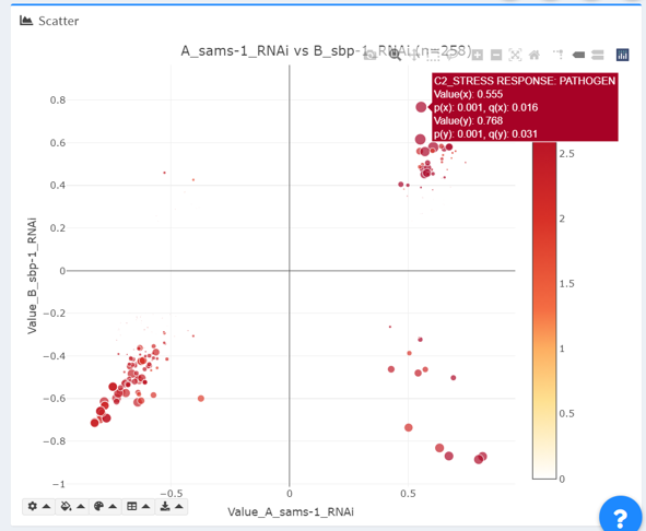
2D Scatter
For two selected datasets (denoted X and Y), easyVizR provides an interactive two-dimensional scatter plot (rendered with plotly).
By default, the differential expression metric (“Value”) is plotted.
To specify which set of terms to plot, user can choose among five options:
- “Both X and Y” = 𝑋∩𝑌
- “Either X or Y” = 𝑋∪𝑌
- current intersection (same as in “Intersection of Interest”)
- common intersection = included in all gene lists
- any intersection = included in any one or more gene list(s).
To better situate a set of terms in the full correlation profile, excluded terms can be optionally shown in the background in light grey.
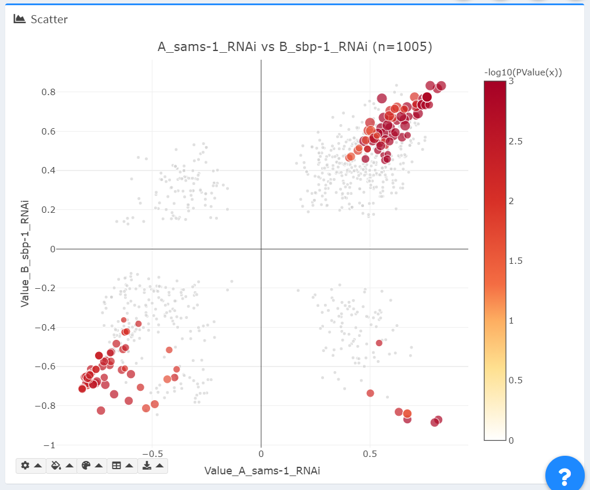
For the plotted data points, three coloring options are provided:
- In “none”, all data points are shown as solid black dots. This is best when one wants to see the general spread of the data. Sizes are defined as (multiplier+2).
- In “discrete colors”, data points satisfying an additional threshold are highlighted in red. “OR” and “AND” modes dictate if the filters should be satisfied in any, or both of the datasets. Sizes are defined as (multiplier+2).
- In “color and size”, the chosen statistical significance value is used to specify color and size of data points. Colors are displayed as –log10(PValue(X)); sizes are defined as –log10(PValue(Y)) * (multiplier+2).
For any point in the plot, users can hover over individual data points to see details about its metric, p-value and FDR in datasets X and Y.
To prevent infinity errors in log transformation, PValue or FDR exactly equal to 0 are manually set at 10e-5 (0.00001) when plotting. Terms with NA in either dimension are excluded.
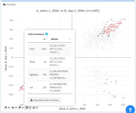
Color summary: in the “color summary” dropdown, the displayed colors of data points are tallied into a table, which is available for download as a comma-delimited file.
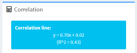
Correlation: the correlation coefficient r^2 is displayed on the left, along with the equation for the correlation line.
Note: all points in the scatter plot are used to calculate the correlation, regardless of color, size or position (foreground/ background).
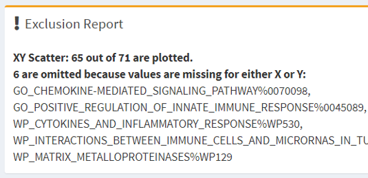
Exclusion Report: Due to the nature of the scatter plot, terms missing values on one of the dimensions cannot be plotted. These are shown in the exclusion report below the scatter plot.
Term exclusions happen when identifiers are not shared across all your datasets, AND you have selected one of the following:
- “False” or “Ignore” in one or more dataset during intersection selection
- “Either X or Y”, “X OR Y OR Z” or “Any Intersection” as plot mode
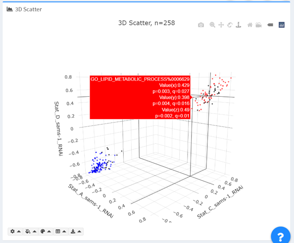
3D Scatter
For three selected datasets (denoted X, Y and Z), an interactive three-dimensional scatter plot is rendered with plotly.
- Same as the two-dimensional scatter plot, the user can choose the set of terms to plot, optionally display excluded terms in the background, and hover over points to see details.
- Two coloring options are provided: “none” and “discrete colors”. In “discrete colors”, terms that fulfill the specified thresholds are plotted in red or blue, for shared positive or negative regulations, respectively.
By default, the differential expression metric (“Value”) is plotted. Sizes are defined as (multiplier-1). Terms with NA in any dimension are excluded (see exclusion report below).
Single dataset visualizations
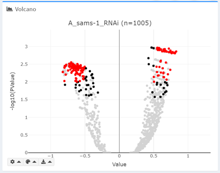
Volcano
Volcano plot plots the -log10(PValue) against the main differential expression metric (e.g. logFC). Based on defined thresholds, certain terms are highlighted.
By default, only the selected intersection is included in the graph. Additionally, excluded terms can be shown in the background in light grey.
To prevent infinity errors in log transformation, PValue exactly equal to 0 are manually set at 10e-5 (0.00001) when plotting.
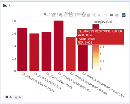
Bar Plot
Bar plot can be used to plot any shared numeric column (“Value” is plotted by default). Bar plot is only available if the number of genes in selected intersection <= 15.
Colors are displayed as –log10(PValue(X)). To prevent infinity errors in log transformation, PValue exactly equal to 0 are manually set at 10e-5 (0.00001) when plotting
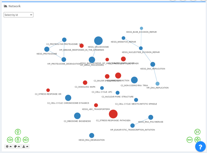
Network for leading-edge genes (GSEA results only)
The Network module is only available for GSEA datasets with a valid column for leading-edge genes delimited by a specific separator.
- Nodes represent terms in the selected intersection;
- Edges are defined by the sharing of leading-edge genes in a user specified dataset. By default, edge sharing is calculated with a Jaccard coefficient of 0.25.
- Red represents upregulation (a positive “Value”); blue represents downregulation (a negative “Value”).
RRHO
Rank-rank hypergeometric overlap (RRHO) is a two-dimensional visualization algorithm that represents correspondence between two differential expression profiles using a ranked-list approach (Plaisier et al, 2010).
To run RRHO, users are prompted to select two datasets to compare. From the p-value and differential expression metric (e.g. logFC, ES), rank scores are automatically computed with log10 transformation, and the results are ordered into ranked lists. The algorithm then steps through the two ranked lists, and statistical significance of the number of overlapping genes above the sliding threshold are computed in succession. The resulting p-values are assembled into a hypergeometric matrix, which is used to plot the RRHO level plot.
An in-depth explanation of the algorithm and examples for result interpretation are found in the original paper.
Two complementary visualizations are included in this module: level plot and rank-rank scatter.
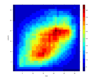
Level plot
The RRHO level plot is generated from log10-transformed hypergeometric P-values.
Color scale indicates log10-transformed hypergeometric P-values; under-enrichment is indicated by negative values. Normally, no white cells should occur, but if they do, they may correspond to hypergeometric P-values of zero.
Step number and step size dictate the resolution of the graph. Smaller step sizes generate more detailed graphs, but take up a lot of computational resources. By default, for ranked lists of n<1000, step number is set as sqrt(n); for large lists of n>=1000, step number is capped at sqrt(1000).
“Hotspots” in the plot correspond to places where the two datasets are most similar.correspond to places where the two datasets are most similar. Strong correlation is indicated by high values along the diagonal; see examples here.
Rank-rank scatter
Besides the level plot, an additional rank-rank scatter plot is provided to visualize the spread of the data. Spearman’s correlation coefficient (rho) is also provided.
For examples of weak, medium and strong correlation, see here.
Support
Feel free to reach us at evitta@cmmt.ubc.ca if you have any questions.
FAQ
Uploading files
Q: I'm seeing a lot of numbers in the header selection, why is that?
A: Check if your files have a header column. By default, the app uses the first row as the header column.
I'm uploading differential expression data. My files always give me “duplicate name” warnings, although there shouldn’t be any?
A possibility is that you saved your .csv files using excel. Excel automatically converts some gene names to dates, which can cause this error. As the link suggests, take extra precautions when working with excel.
I'm uploading a folder of files, and somehow it errors out.
Please check the following: 1) your folder only contains the files you wish to upload, 2) all the files share the same set of column names, and 3) there are no formatting problems (e.g. white lines) inside the csv files.
Filtering and intersection selection
Q: I chose to filter by gene list, but now nothing shows up in the visualizations and the table and I get no "gene not found" message.
A: Most likely your genes don't fulfill the active filters and are excluded. Try removing all the filters.
Q: The values I see in Venn aren’t matching up with the number of points in the scatter plot!
A: Some data points might have gotten excluded. Number of excluded items + number of plotted items *should* equal to the corresponding Venn count.
Tips and Tricks on getting the set you want
Q: How do I see all the genes/ gene sets, without any filters?
A: Select “Ignore” in the intersection selection panel for all datasets. Filters should not matter.
Q: How do I see all the genes/ gene sets that have values in all datasets?
A: Select “No filters” in the filtering panel, and select “True” for in the intersection selection panel.
Q: I want to see “genes that are significant (p<0.05) in dataset X but NOT in dataset Y”.
A: Select p<0.05 for both X and Y, then select True for X, and False for Y.
Visualization
Q: I ran into problems with plotly graphs in Safari.
A: Plots rendered with plotly may not display properly in safari. Refer to “known issues” below.
Q: Parts of the interface randomly froze or became blank?
A: Make sure no visualization algorithm is running in the background. If this is not the case, this is likely a bug. Navigate to another tab and come back to refresh the UI; this should fix it in most cases. Drop us a bug report as well.
Q: I'm using this to plot GSEA data. I included the leadingEdge at upload, but now it won't show up in the heatmap, help?
A: Check if all your selected datasets have the leadingEdge column, and if the column has the same name. The heatmap only shows columns that are shared among all datasets.
Known issues
- For the plotly interactive graphs, the top right "download as png" button might not work. This is a bug within plotly itself. Please download as html or take a screenshot instead.
- The interactive 3D scatter may not render in Safari. This is a bug within plotly itself. Please use another browser (e.g. Chrome) to draw the plot.
Safari users: